Composition
Composition is how the different parts of a photo are arranged, there are many different ways that a composition can be made up by.
There are 4 different types of composition. (Rule of thirds, Balancing elements, layers, triangles)
There are 4 different types of composition. (Rule of thirds, Balancing elements, layers, triangles)
Rule of Thirds
|
The rule of thirds, splits the photo up into 9 different parts, by putting the main part of the photograph on one of the 4 lines it tends to make the photo more interesting or (aesthetically pleasing)

|
Balancing Elements
|
Although we have the rule of thirds this cannot always be applied when there is only one element to the photo because it can make it feel void
|
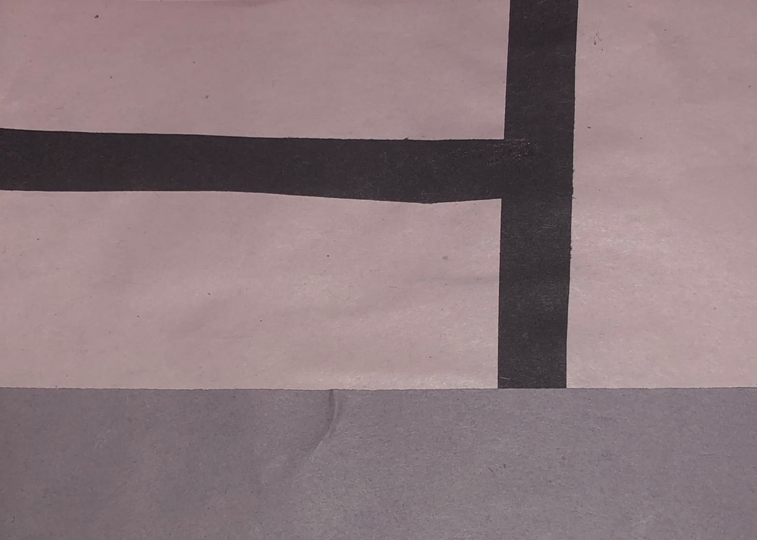
Triangle

|
A good way to group images is through triangles, because it establishes a relationship between the image and the object
|
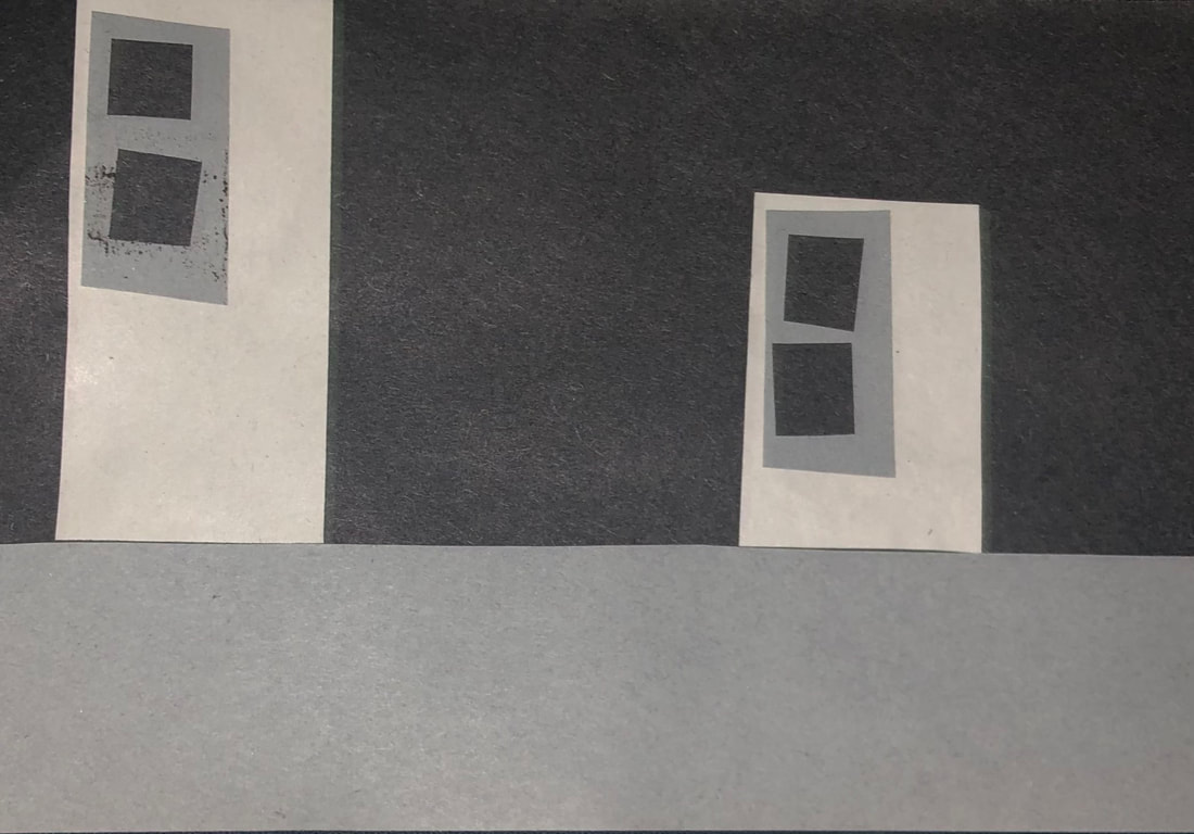
Layers
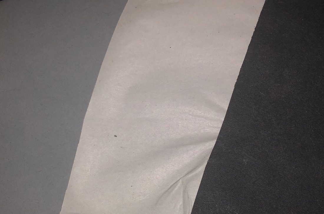
|
Good photography is about converting a 2D photo back into it's original 3D form, to do this we use layers.
|
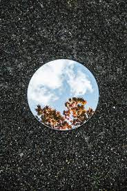
Sebastian Magnani

|

|
|

|
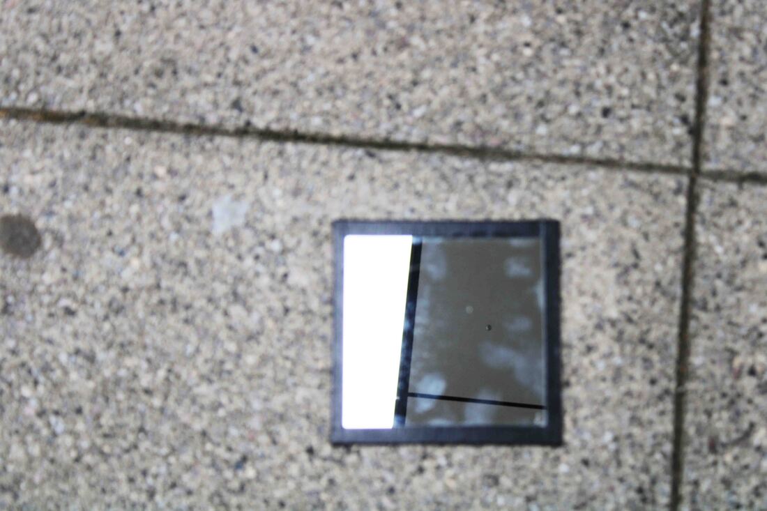
This is Sebastian Magnani and he takes photos of nature. In his way of photography, instead of taking a picture of the object of nature directly he instead uses a mirror and photograph's it through that.
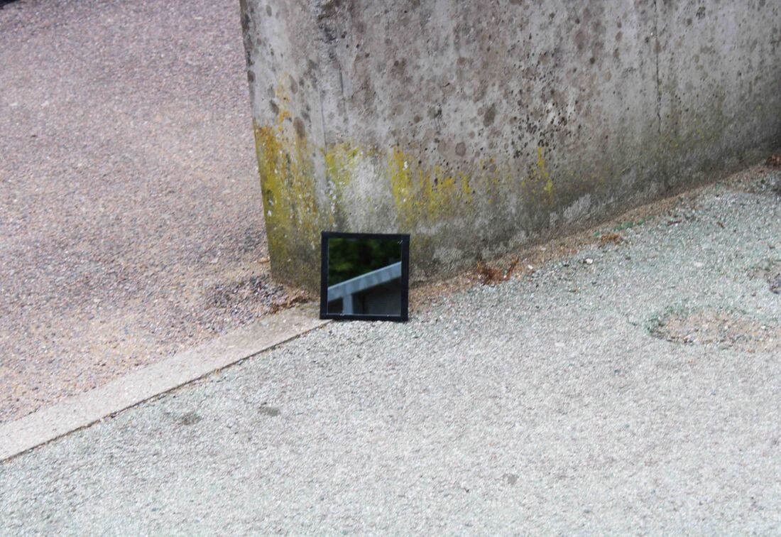
My Response
|
|
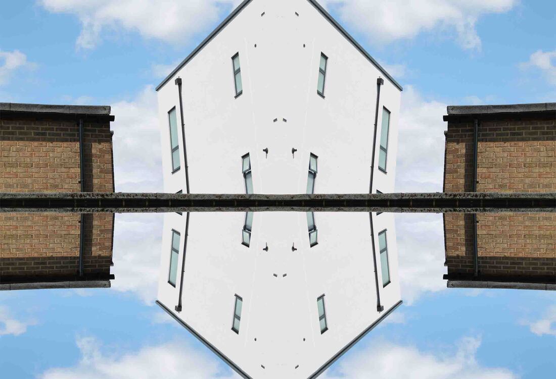
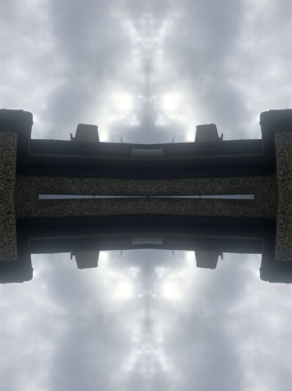
In my response I took photos through a mirror which I thought represented Sebastian Magnani's work well, with some of my work compared to his I did all of my photos so that what is in the original pictures is also in the reflection but with some of Magnani's work, he takes a photo of something, then puts the mirror down and it is a completely different background.
|
Final Result


|
WWW: I like how some of the photo's align with the reflection in a straight line
EBI: I could get photos of something but it has a complete different background |

|
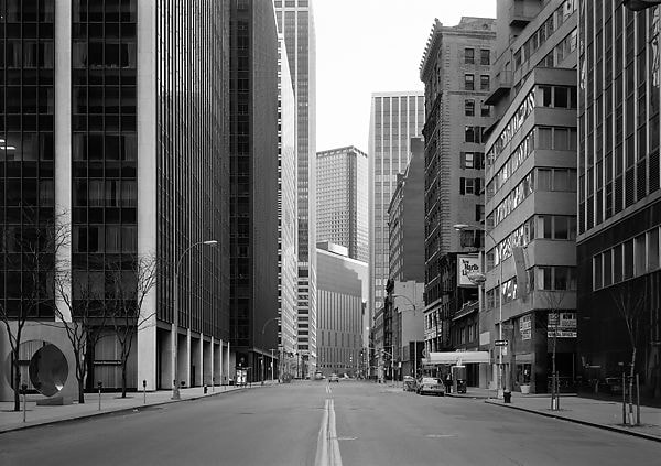
Andy Yeung
|
|
|
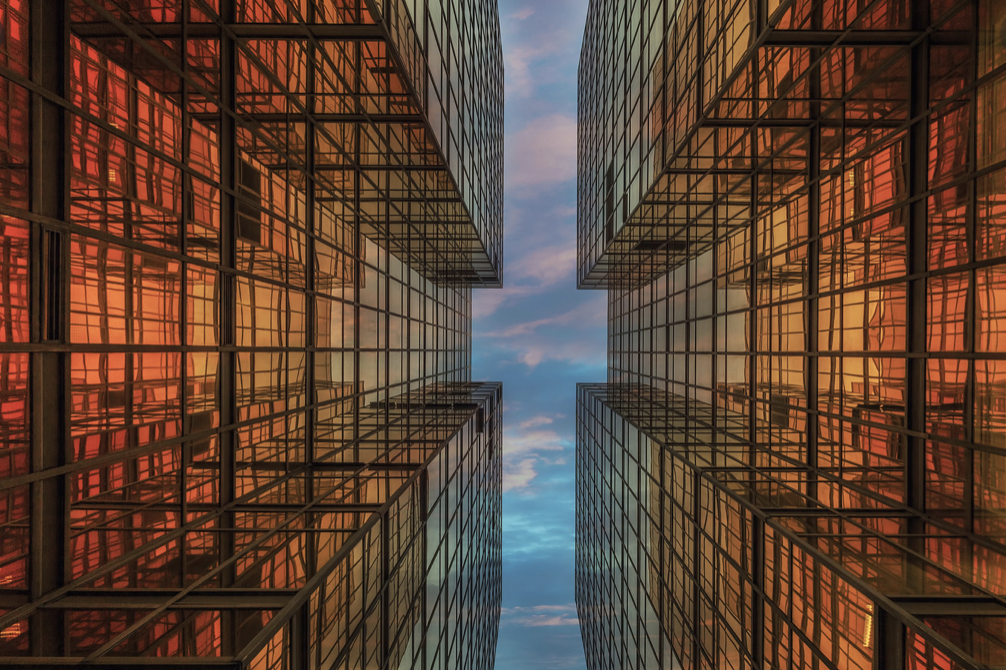
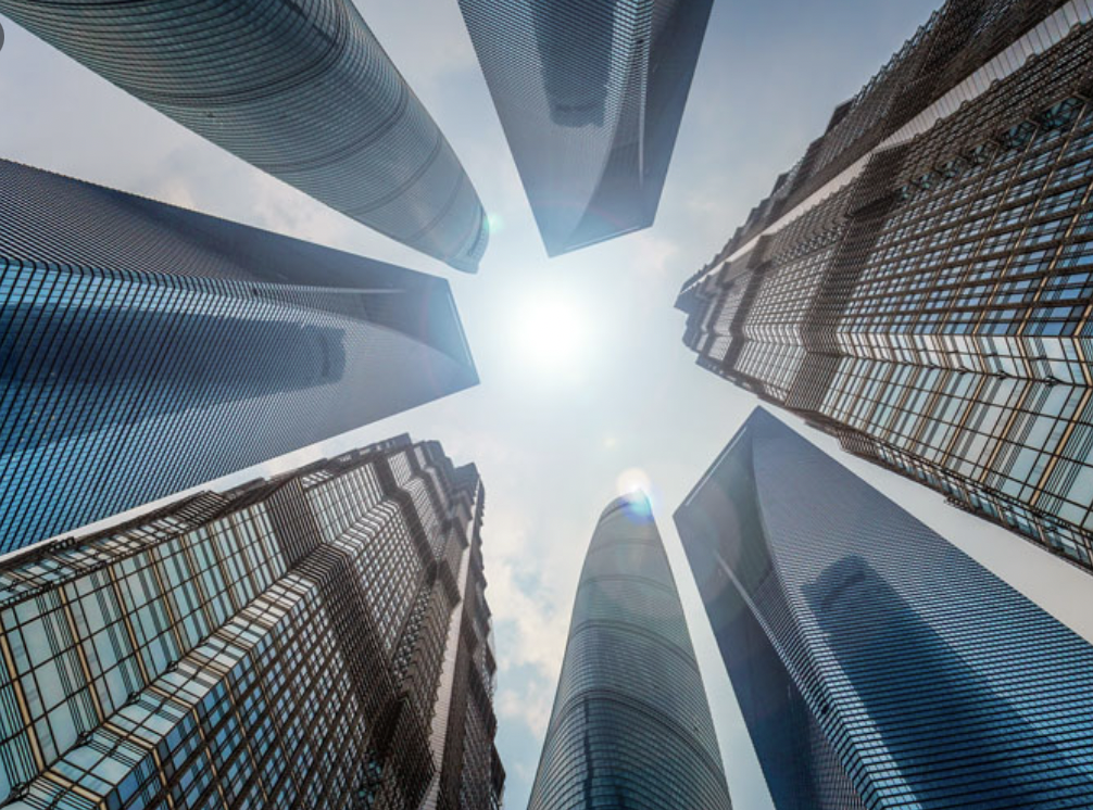
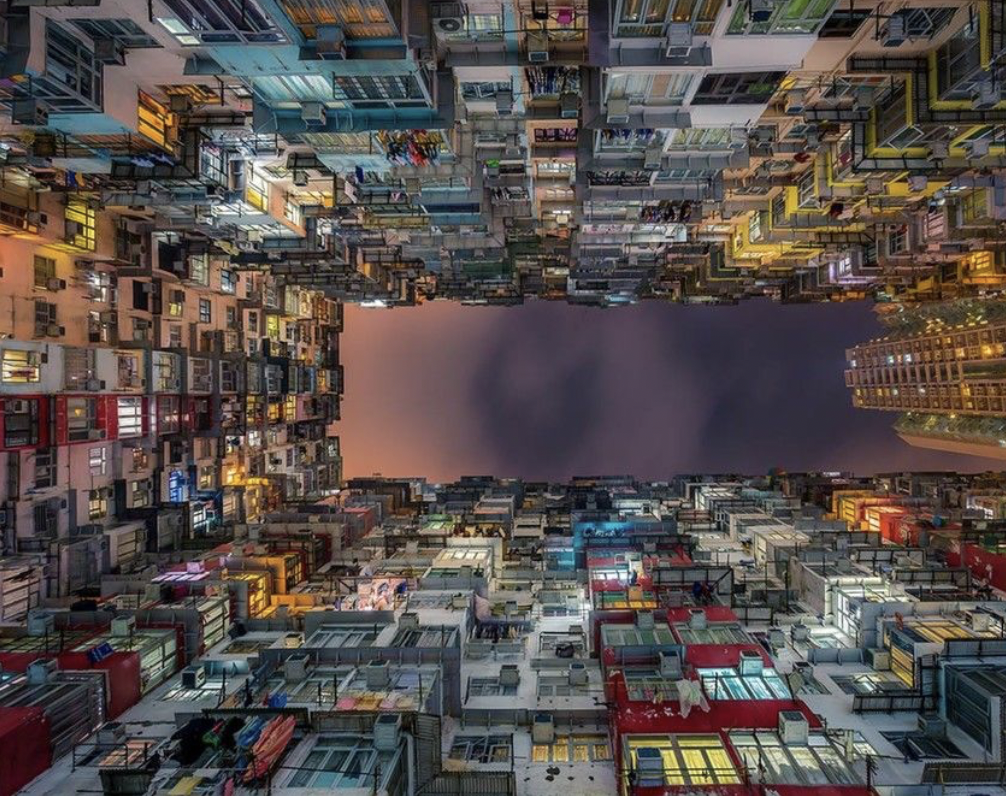
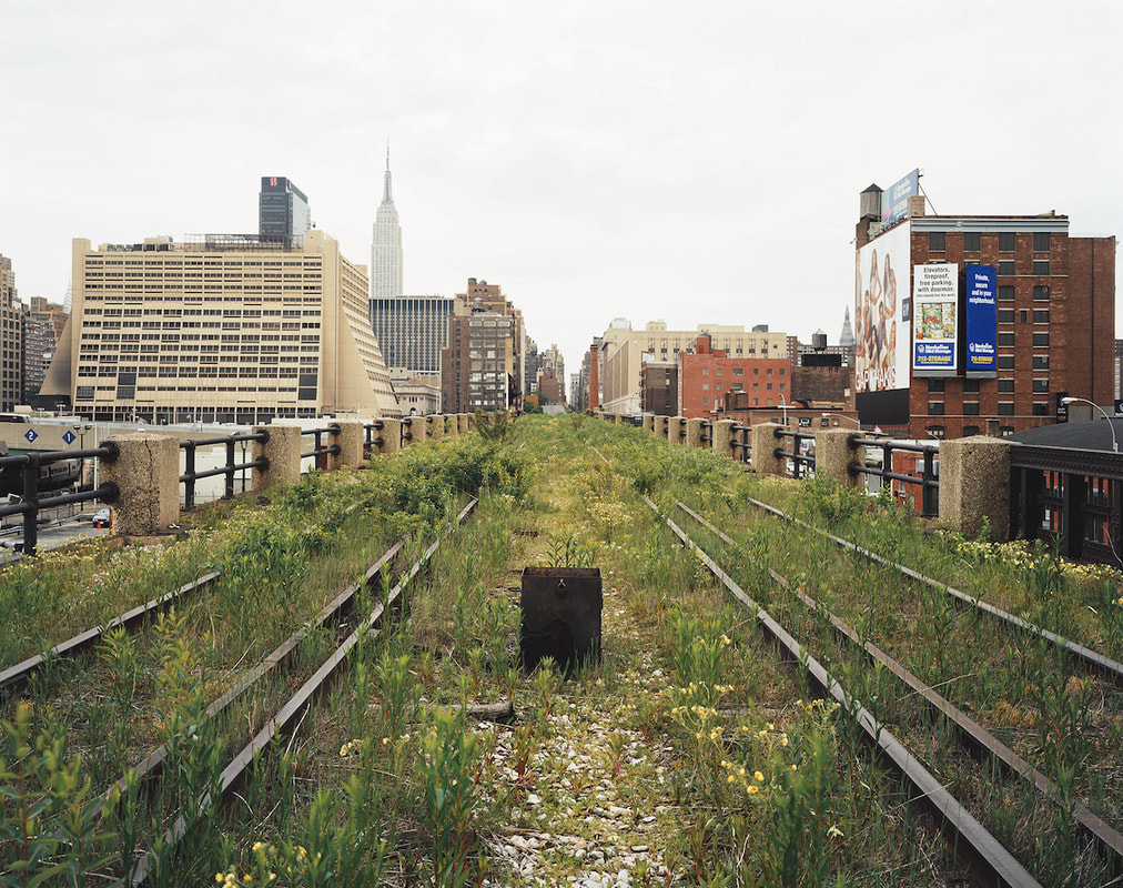
Andy Yeung's photos are of different cities high rise buildings along with the sky in the photo aswell, I think that Andy Yeung is trying to show two parts to one photo, in these examples it is capturing the building and the sky at the same time, I think that Andy Yeung tries to frame his photos by just trying to get as much in them as possible so that he can capture the widest image, the interesting thing about the background to these photos are that the buildings are usually the same/similar colours to the sky at the time, I like them because I find them aesthetically pleasing.

|

|
|
|
In my response I took photos of the sky with certain objects in the background and side I think the pictures that I took in the lesson are good because of the resources that we had available at the time, for example, some of Andy Yeung's photographs are taken at sunset or sunrise whereas we couldn't do that so I think that based on what was available that I didn't do badly.
|
|

|

|
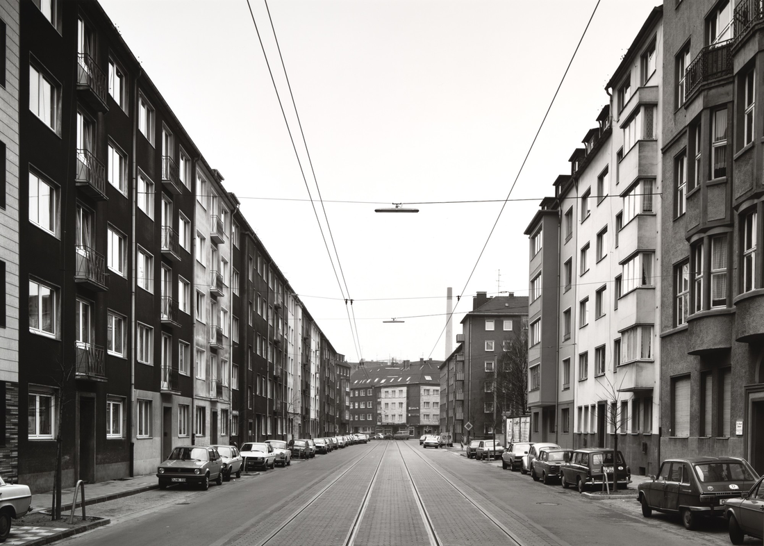
Romain Jacquet-Lagrèze
|

|

|
This is some of the work by Romain Jacquet-Lagrèze, I don't like it because it does not look as good as some of the work by other artists, for example, a few of Andy Yeungs photos are taken at sunrise or sunset this gives them a cool background effect whereas these just look like they are just photos of low cost buildings.
|
|
|
|
|
|
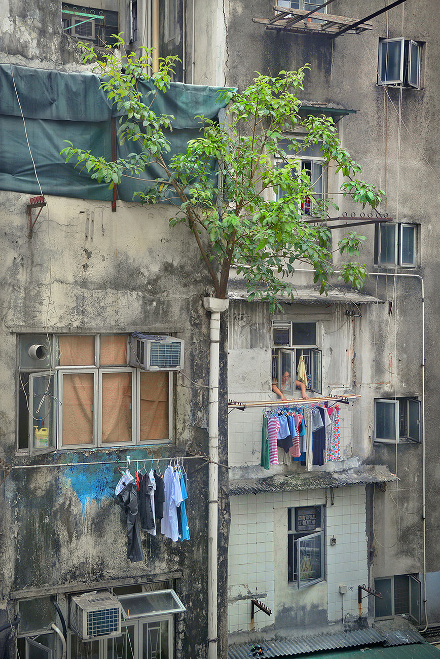
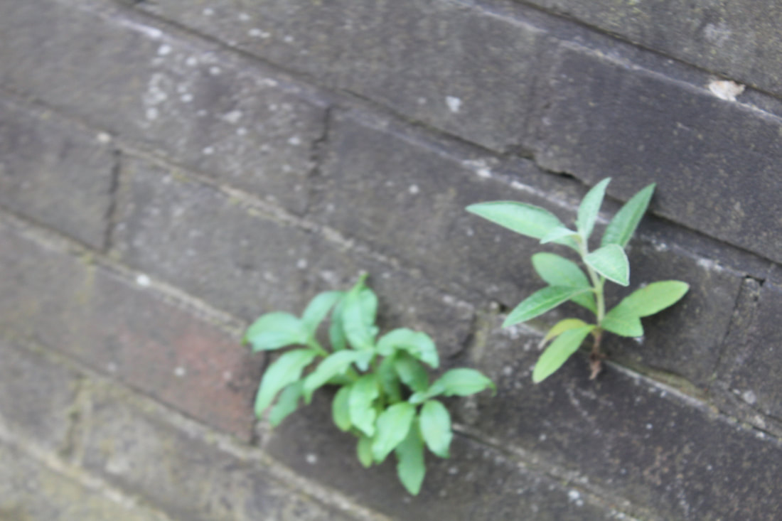
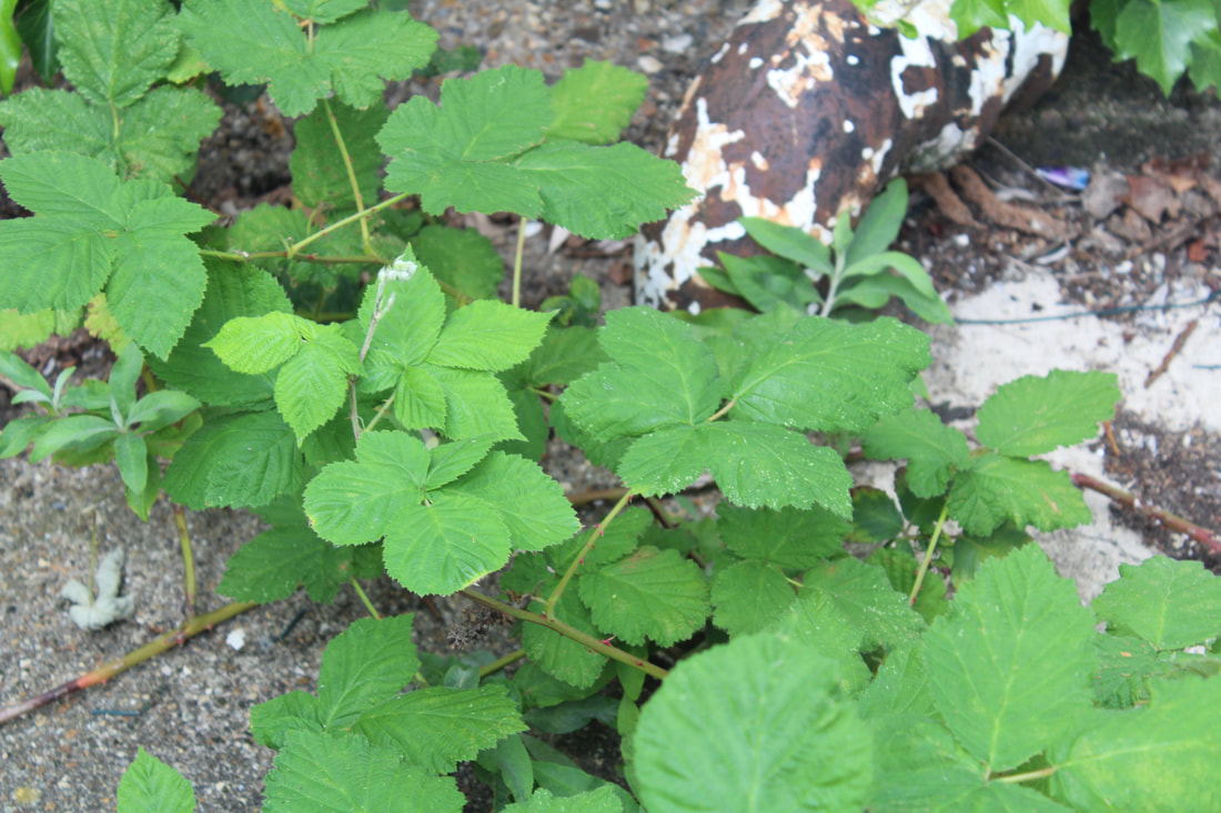
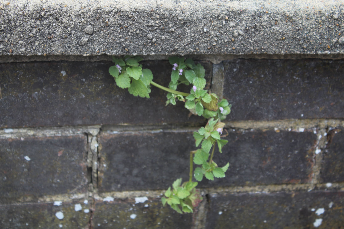
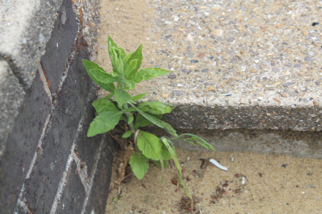
In my response, I took photos around school of natural organisms growing out of the buildings, I think that I showed this well getting a lot of different angles and photos, but I think that it could have been better if I would have held the camera more still or have used a tripod.
WWW: I like how all my photos were all small plants/weeds coming out of brick walls or the ground EBI: I could have held the camera more still when taking the photos |

|

|

|

|

|
In my personal response I took photos of plants growing out of areas in my garden where the plants aren't necessarily meant to be growing but nature is taking back.
|
Independent Development
Matt Barnes
|
|
|
|
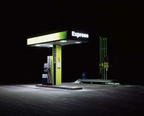
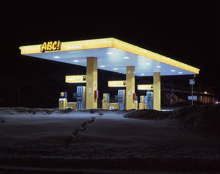
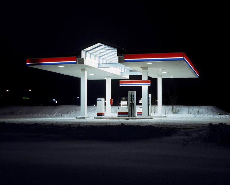
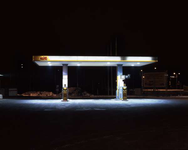
Matt Barnes is a London based photographer who usually bases his work around non-human places. In this example you can see his work on cold stations, taking photos of petrol stations when they are empty making them look almost deserted and lifeless. I think that this is done well by the fact that the backgrounds are really dark and the lights that are coming off of the petrol station are really bright. He achieves this well because he takes the photos using a very small aperture and a very large depth of field therefore he must use a tripod and the shutter speed is long. He is currently my favourite because of how aesthetically pleasing his work is but this will also make his work the hardest to recreate and also because the work that he does is rare.
Minor White
|
|
|
|
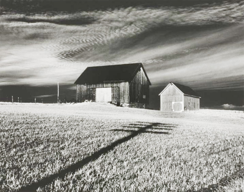
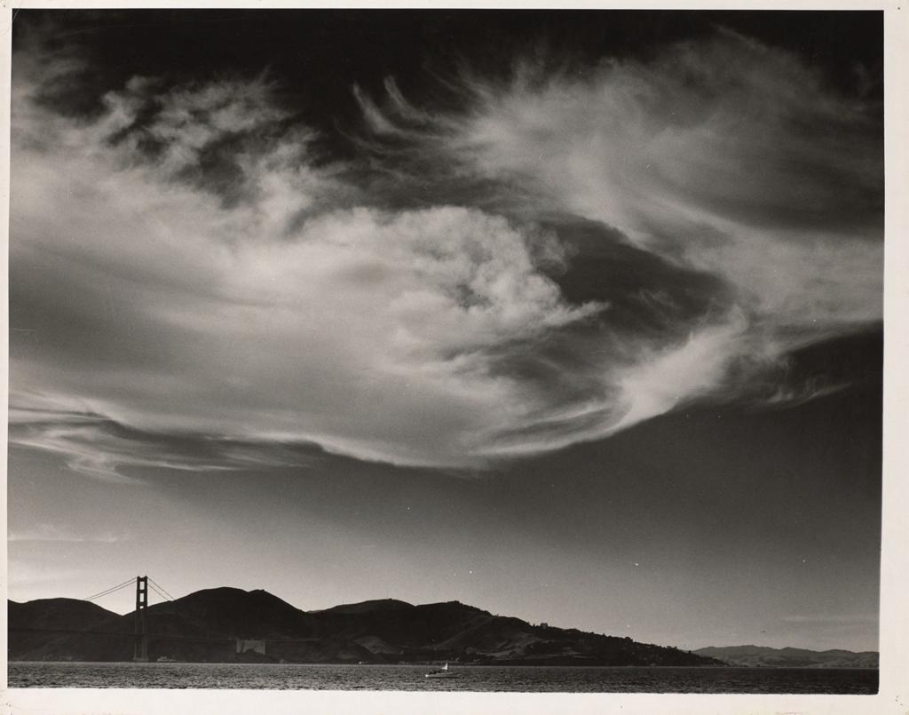
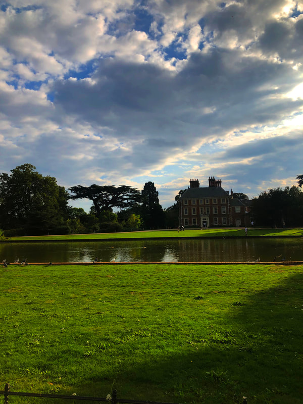
Minor White is an American photographer, he made thousands of black-and-white and colour photographs of landscapes and people, he was very well known for this. He once said “At first glance a photograph can inform us, At second glance it can reach us." To take his photos he probably uses a long shutter speed, you can tell this because of the way that the clouds are in his photos.
My Response

|

|

|

|

|
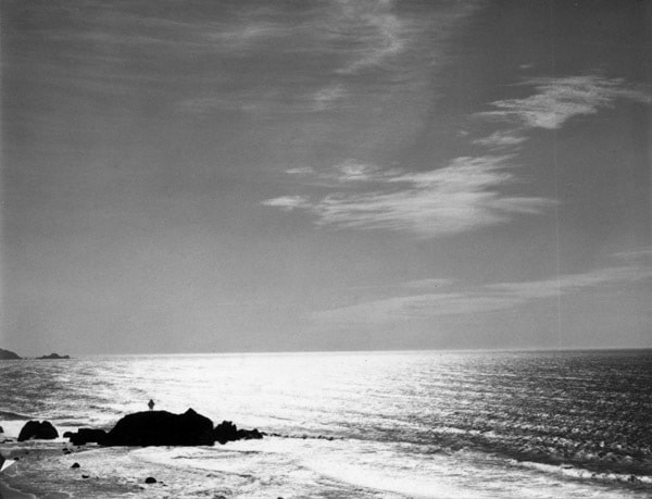
WWW: I included the clouds well in the first 3 photos and the clouds bring extra detail to the photos and they make them a lot more interesting whereas in the last 2 photo's they look lifeless and dead because the clouds are just plain
EBI: My photos can be a lot more interesting if I were to take all of my photos facing landscape and if I were to have something in the foreground of the photos aswell as the background just like some of the work that Ansel Adams does. (below)
EBI: My photos can be a lot more interesting if I were to take all of my photos facing landscape and if I were to have something in the foreground of the photos aswell as the background just like some of the work that Ansel Adams does. (below)

|

|

|
My Response
|
|
|
|
|
|
I think that I could improve on this photoshoot by making it more of a natural background instead of the human backgrounds that I have in my current photos.
|
|
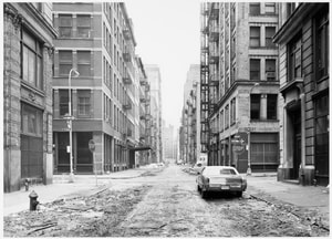
Thomas Struth
|
|
|
|
Thomas Struth is a German photographer who is best known for his Museum Photographs series, family portraits and black and white photographs of the streets of Dusseldorf and New York taken in the 1970s. Thomas Struth began to study at an Arts Academy in Dusseldorf. Initially he was interested in photography as a source for his paintings. In order to learn more about the different possibilities of all the materials that he cold use, he made some experiments photographing in the nearby streets with different exposures and compositions, using a 35mm camera.
Close Up Abstraction
|
|
|
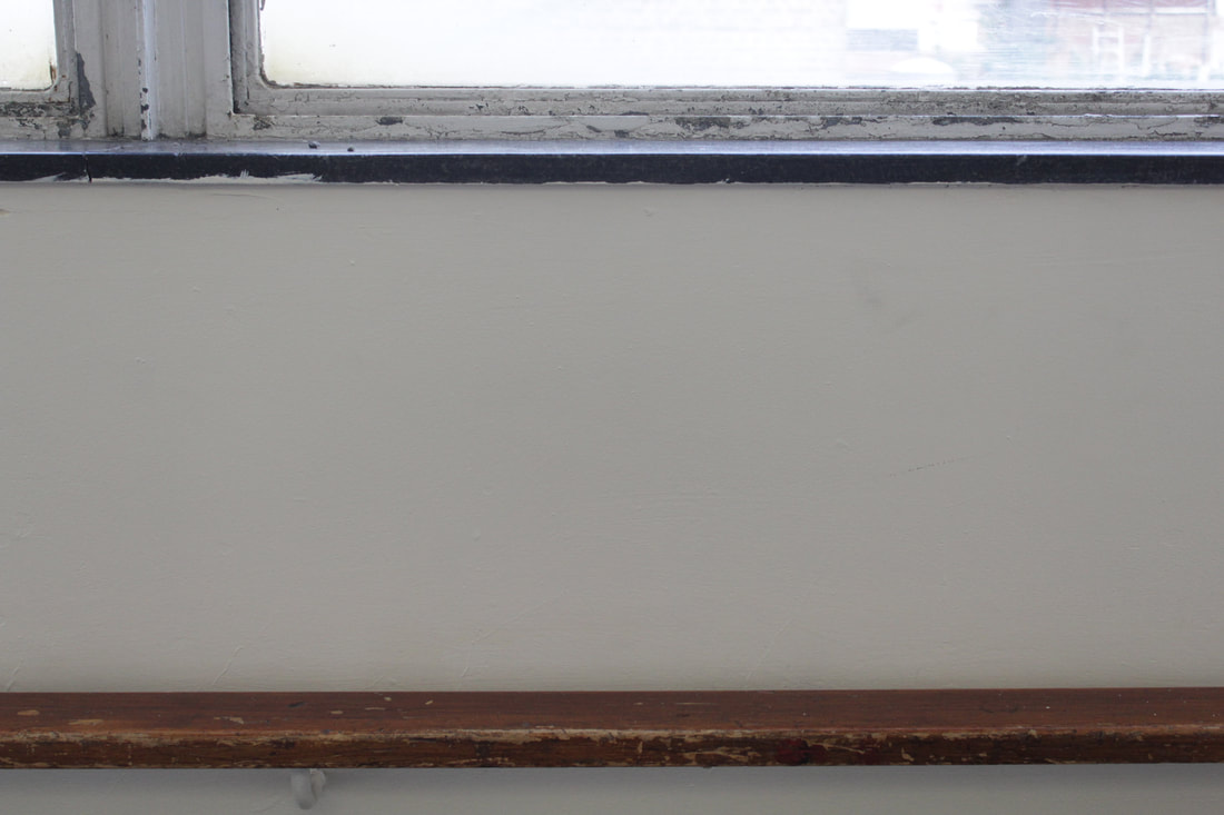
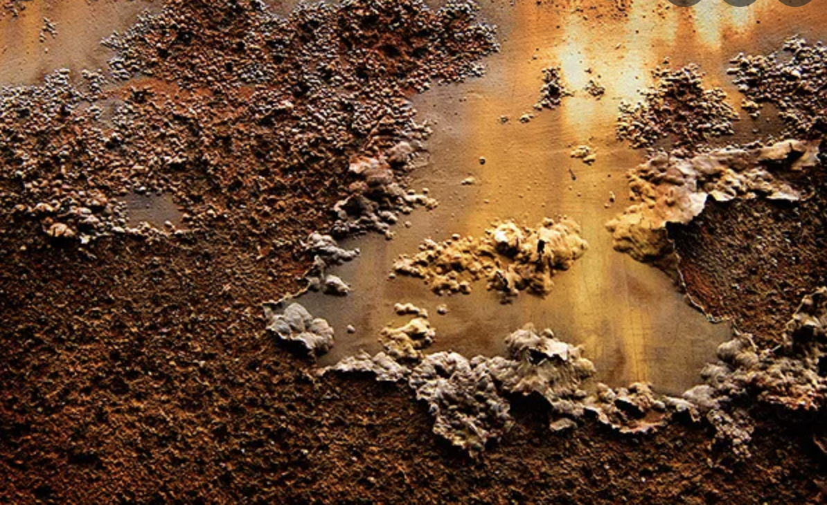
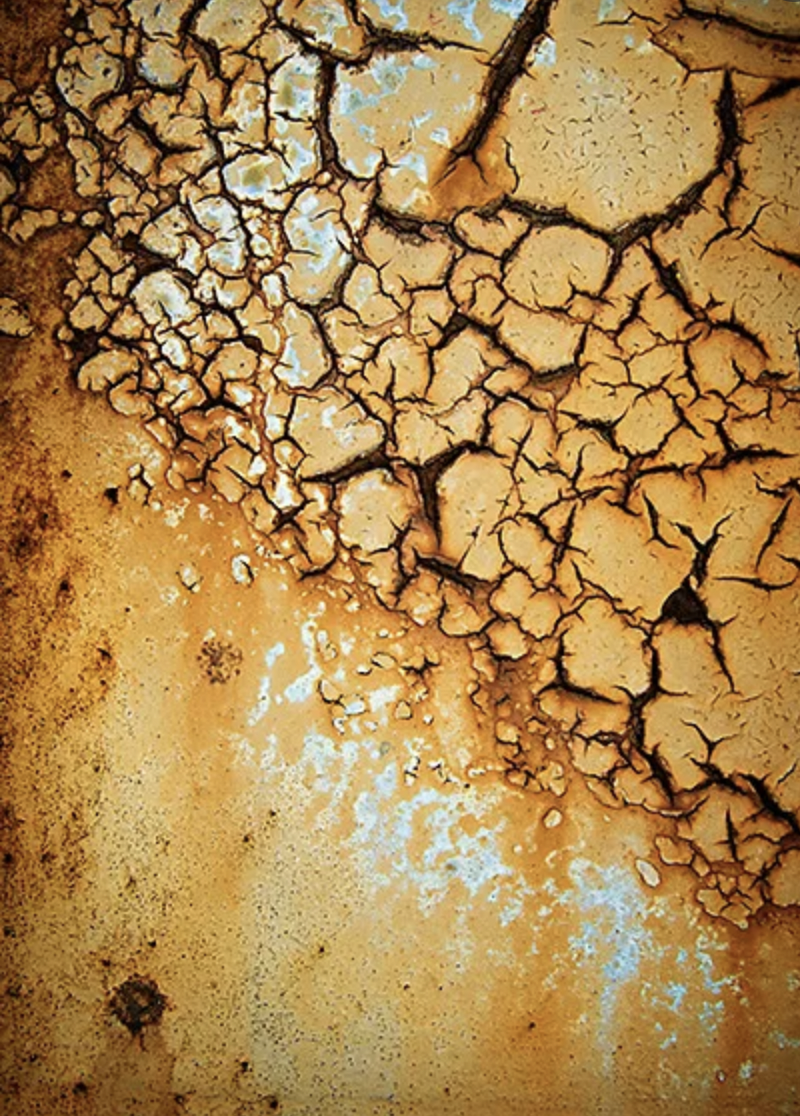
The artist that does the most work relating to this is Colin Winterbottom, he grew up in Washington suburbs, he earned an undergraduate degree in economics and Master of Arts in philosophy and social policy. He worked as a research assistant at the urban institute for eight years before committing to photography full time.
My Home Development
|
These were photos that I took of my house including a far away and then a lot of different close up's
WWW: None of my photo's were out of focus EBI: I could get more interesting photos |
|
|
|
|
|
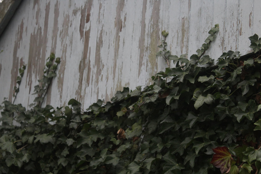
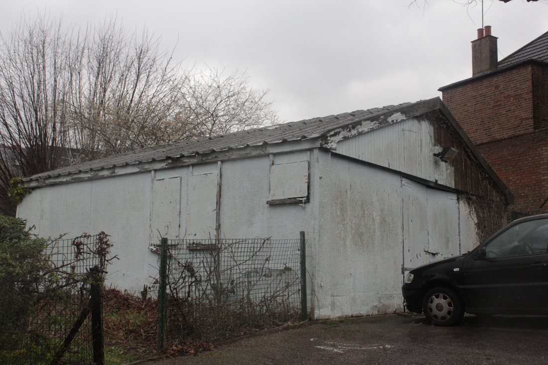
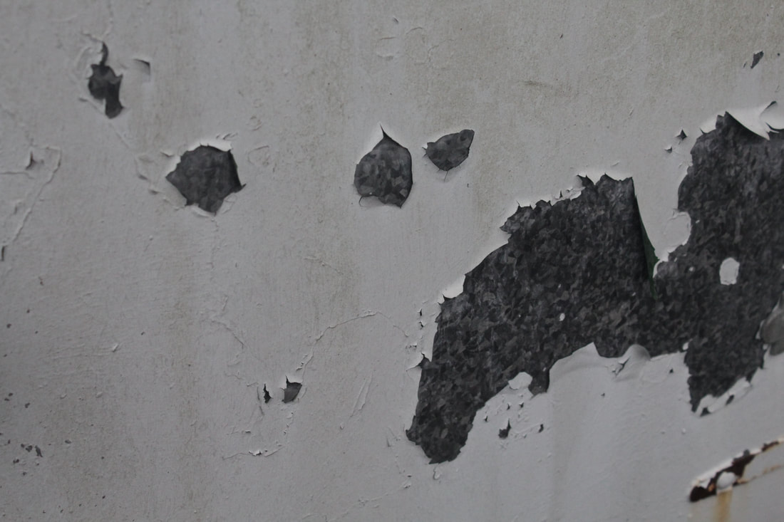
This is my edit for close up and far away, I have taken photo's of an abandoned shed, with the close up photo's scattered around the outside and then the far away photo more in the middle/to the left
|
|
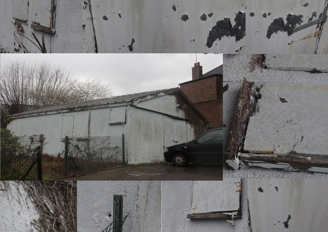
This is my main response for the close up and far away piece of work. For this development I took some photo's of a rustic, abandoned, primeval shed in school and placed it large in the middle and moderate to the left (making it the main attraction). Next, I placed all of the close up photo's in a smaller size, around the main photo of the shed. An average pedestrian walking past this generic shed wouldn't notice anything eye-catching; nothing worth taking a minute and analysing it. There is more to this run-down shed than meets the eye. By highlighting elements of the shed itself and its surroundings, the piece evokes a sense of curiosity to the viewer as the close-ups call attention to things somebody could miss.
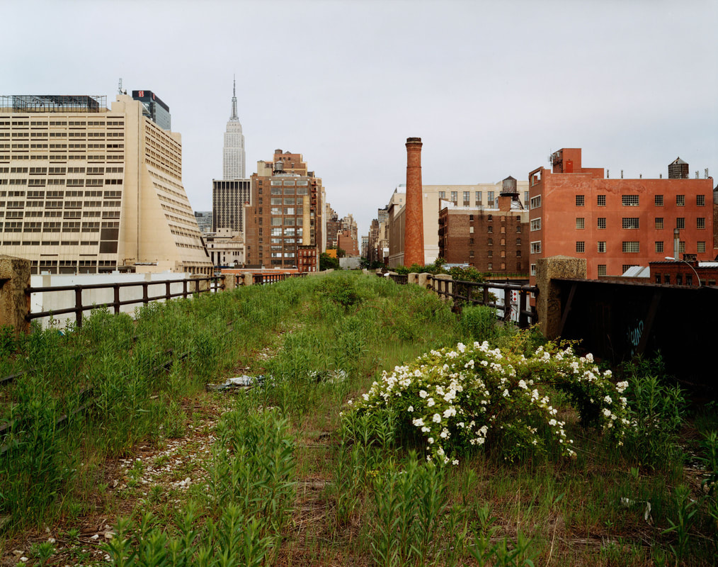
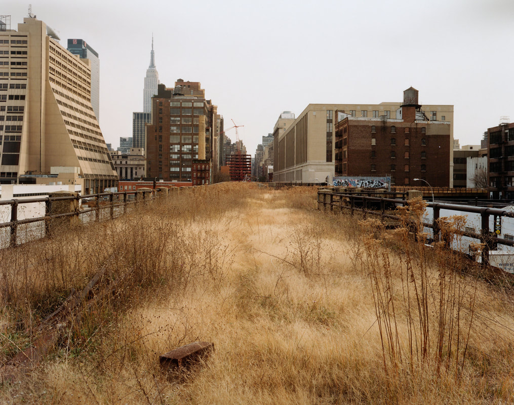
Joel Sternfeld
|
|
|
My photos were partially inspired by Joel Sternfeld some places for improvement in my work could be taking my photos landscape and not portrait
WWW: I like how none of my photo's are extremely blurry where you cannot see anything
EBI: I need to ensure that I take ALL my photos LANDSCAPE and ensure that I add more manmade objects in my photos
WWW: I like how none of my photo's are extremely blurry where you cannot see anything
EBI: I need to ensure that I take ALL my photos LANDSCAPE and ensure that I add more manmade objects in my photos
My Response
|

|
These are my two favourite photos that I took over the project with part natural and part human project because in both of them the grass is really green and that in one of them there is a massive building that is obviously human built but in the other one there is only a stick that would also have been put in by a humans but they are both representing the same things but at different scales.
Ameena Rojee

|

|
Ameena Rojee is a campaign manager for the British Journal of Photography, a London-based artist and graduate of the University of the West of England. Her photography has recently focused on landscapes observed in everyday life and on journeys. Her series "Camino," which depicts the Camino de Santiago pilgrimage path and also begins in the south of France and runs across an amorphous environment until it reaches the cathedral of Santiago de Compostela in Galicia (North Western Spain) is particularly noteworthy. Walking and photographing together is an exercise in observation - in getting outside of our heads and focusing on the natural world around us. Her pictures bring a sense of normality in to the modern world. Nature is one of the most fundamental qualities of Earth therefore, I love how Ameena focusses her photographs on plants and attributes of nature that a normal person can relate to seeing. On the other hand, some people are out of touch with nature. Ultimately, Ameena creates an effect that forces people to appreciate the beauty and wonders of nature. Ameena uses a broad dynamic range within her photographs. The darkness highlights the lightness and the lightness highlights the darkness. The dynamic range determines the detail that can be captured within the image. As a whole, it plays a huge part in the effect the photographs have on the viewers as it solely depends on its physical appearance. These photographs consist of the luminance range and the scenic overview of the plants.
Development 1

|

|
My photographs evoke a breath-taking view on nature. I captured a variety of colours within the photos- ranging from vibrant to darker spectrums. The colours contrast nicely against each other. They have perceptual effects as the green is the main subject. That's what makes my final piece fun, energetic and vibrant. The shadows in the second image serve a whole range of aesthetic functions; they direct the viewer's gaze and explicitly describes the form of the photograph. Furthermore, they emphasise the texture, creates a sense of mystery, improves the balance of the composition and becomes the subject of the image themselves. Shadows hold a huge power over the entire feel of the image.
Along with everything listed, the shadows against the concrete adds a dimension of creativity and makes the photo come alive. Moreover in both images, the colour contrast conveys a mood of optimism and joyfulness. The high contrast photos pop out and shows textures in the subject and give a feeling of edginess, high energy and strength. The fact neither images contain any people is an advantage to the ultimate feel of my final piece as pedestrians could distract the viewers from the admiration of nature. Like Ameena Rojee's photographs, she focuses a lot on contrast and close ups of elements of nature. Contrast and slight editing are 2 of the few similarities our photos share. Ameena's photographs have a more cozy, warm mood rather than energetic like mine. This is solely down to her's being photographed with a dark night sky rather than in daytime.
What I like about these final pieces is that it brings in close up and far away with the photo of the bridge also including the rule of thirds, I took these photo's on a fast shutter speed, but I took these photo's with different apertures, with the close up photo of the tree being taken with a larger aperture as opposed to the photo of on the bridge which would have been taken with a very small aperture. What I like about my work is how I have kept the fundamental elements of Ameena Rooje's work the same whilst also moving it away from what she has done, for example, she took some of her photos during the night whereas I chose to take them during the day to increase the vibrancy and colours of my images,
WWW: I took on board the skills of contrast, mood, feeling and tone, just like Ameena's work. This helped me create a professional piece that could compare to a professional photographers. I also acknowledged the fact that Ameena concentrated on close up work, which I done also in one of my photos.
EBI: I could've captured one of the images at night-time with a dark sky, just to create a replica of Ameena's work and see how they both compare in that aspect.
Development 2

|

|

|
|
|
I see the contrast between the artist's work and my work because they both have parts of natural elements mixed with a very wide background. As seen in my last two photos that are in colour, they both contain segments of manmade pieces. One of them is focussed on the background, but on the other hand my photos could be better if I added more of those manmade pieces into my photos- like the ones that are shown above with city skylines behind, surrounding the natural element that has actually overthrown the old human built structures.
The black and white photos that I edited removes all distraction of colour and helps the viewer focus on other aspects of the photo; like the simplicity of the tree, textures, shapes and composition. Furthermore, the black and white photographs contain a completely different mood; they look more formal and serious (in comparison to the radiant images below them) and while they may look more simple, the mood of the photo is more intense, making it more emotional. The absence of colour allows the viewer to solely concentrate on the subject, without any distracting elements. By seeing a black and white image, it gives the viewer a reason to pause and consider the image for a moment longer- in this case, the true meaning behind that tree, with only a few textures on show. Alternatively, the coloured images give a physical, graphic appearance that makes the viewer almost instantly more engaged because they know exactly what they are seeing without having to think too deep. I again applied the skill of shadowing within my editing to highlight the texture of the grass. WWW: I considered the naturist aesthetic and applied photographic skills such as: monochrome images, blurred out segments (to force the viewer to focus on a certain segment of the image) and shadowing. EBI: I could've added more skylines as it is one of the most distinctive outdoor imagery you can capture on a camera. |
Development 3

|

|

|
|
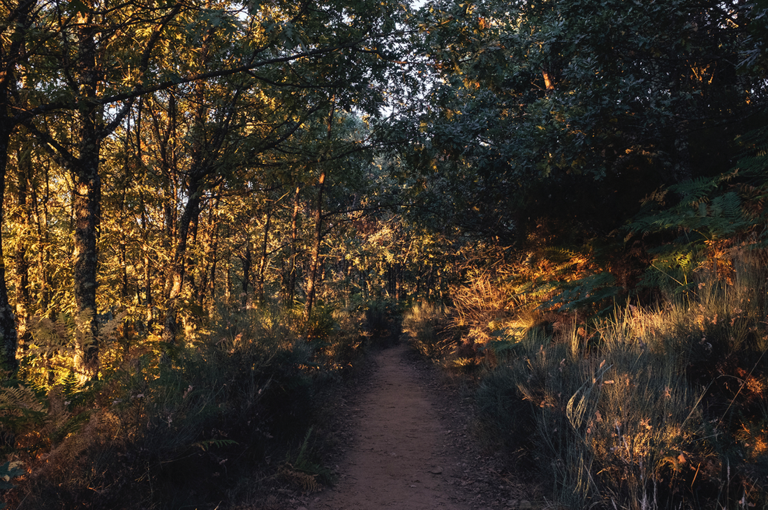
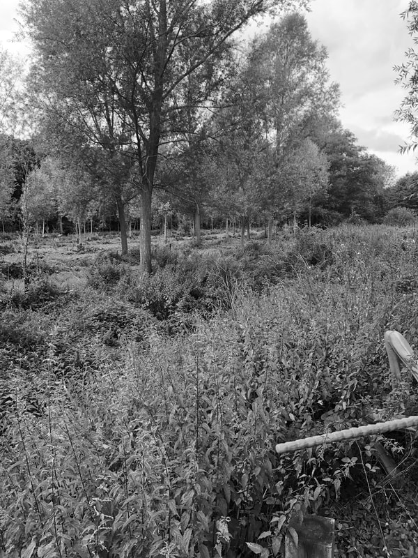
What I have done in my third development from Ameena Rooje's work is I have kept all of my photo's entirely natural so that everything that you see in my photo's are solely attributes of raw nature. The ultimate aim that I wanted to achieve was to capture the beauty and wonder of natural environments. In today's society, no one really cares to admire nature: it is often ignored when in actual fact it is one of the main things that keeps the world going.
WWW: I like all the different angles I used and that they are taken from different tree perspectives. The fact that some of the trees are really close and some are far away creates a variety of dynamics. EBI: I could have taken more photos from each angle. I photographed them portrait when they really should've been landscape. |
|
Development 4
|
|
|
|
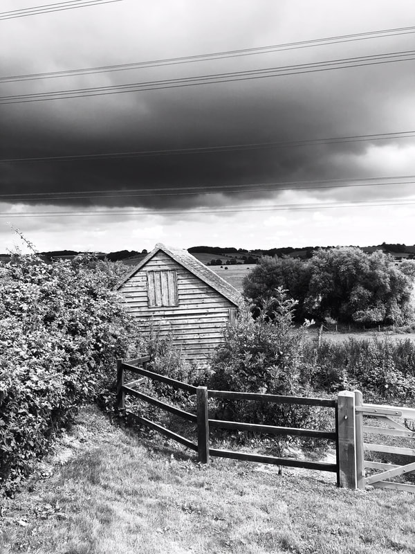
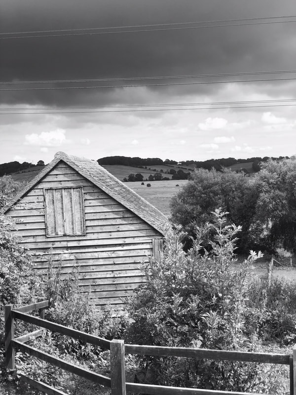
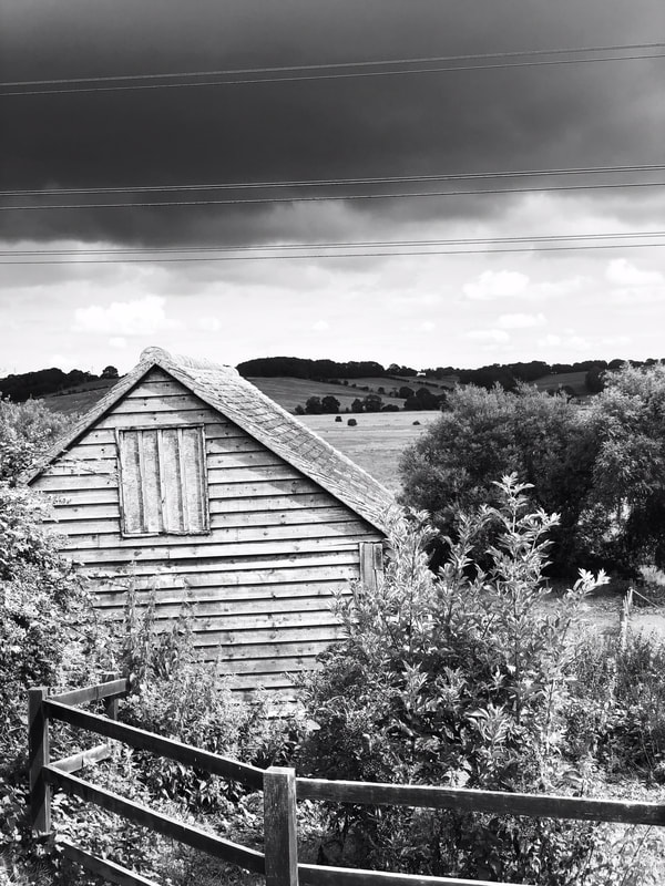
These photos evoke pure simplicity. The monochrome theme throughout the images convey a sense of pessimism because of the clouds towering over the natural landscape.
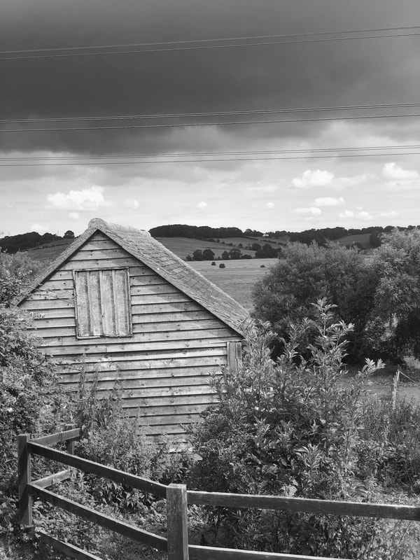
WWW: I like these photographs because it has a building in the foreground then contains fields and hills in the background. The clouds are perfect for the photo because you can see 2 different tones in the sky (blue and grey) and you can also see the rule of thirds in all of the photos. EBI: I could've taken more photos. Instead of a hilly background it could be flat. Also, I took all my photos portrait and they needed to be landscape. |
|
Final Piece

|
|
|
In the first photo it is a close-up of a tree. The rest of the background is blurred. By me blurring out the image during editing, it reduces the noise in the image. The fact that the tree is a close-up makes the viewer 'feel' the subject is right up close. Furthermore, it reduces the field of view, increasing the size of the subject and creating a tight frame around my selected shot. The second and third pictures are mainly focussed on the nature of shrubs, trees and the sky. This is similar to Ameena's work as she focusses on flowers and soil grown plants like shrubs also. The only difference is that Ameena's photographs are in colour and she takes close-ups of the flowers; mine is just a general photograph of the entire background and what is in it. Also, Ameena ensures that there are no manmade items in her photographs, only natural elements. In my work, there is a shed and a wooden railing which are manmade objects. As a whole, I think my work has definitely helped rise the profile of our planet and the environment.
WWW: I think the fact that all of the photographs have the same idea is a good thing because it maintains the same theme throughout my work. I also understood the photographers intentions so I wanted to create my own unique pieces while using theirs for mild inspiration.
EBI: I could've taken my photos landscape. This would've ensured that my photos portrayed features of the external, geophysical world at a larger scale.
