JR Chronicles – Saatchi Gallery
JR: PORTRAIT OF A GENERATION 2004 - 2006
|
|
|

|
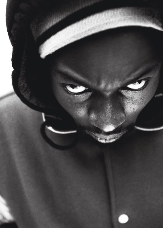
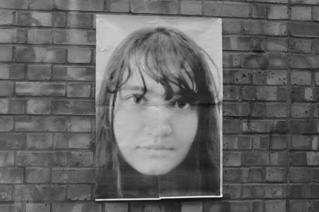
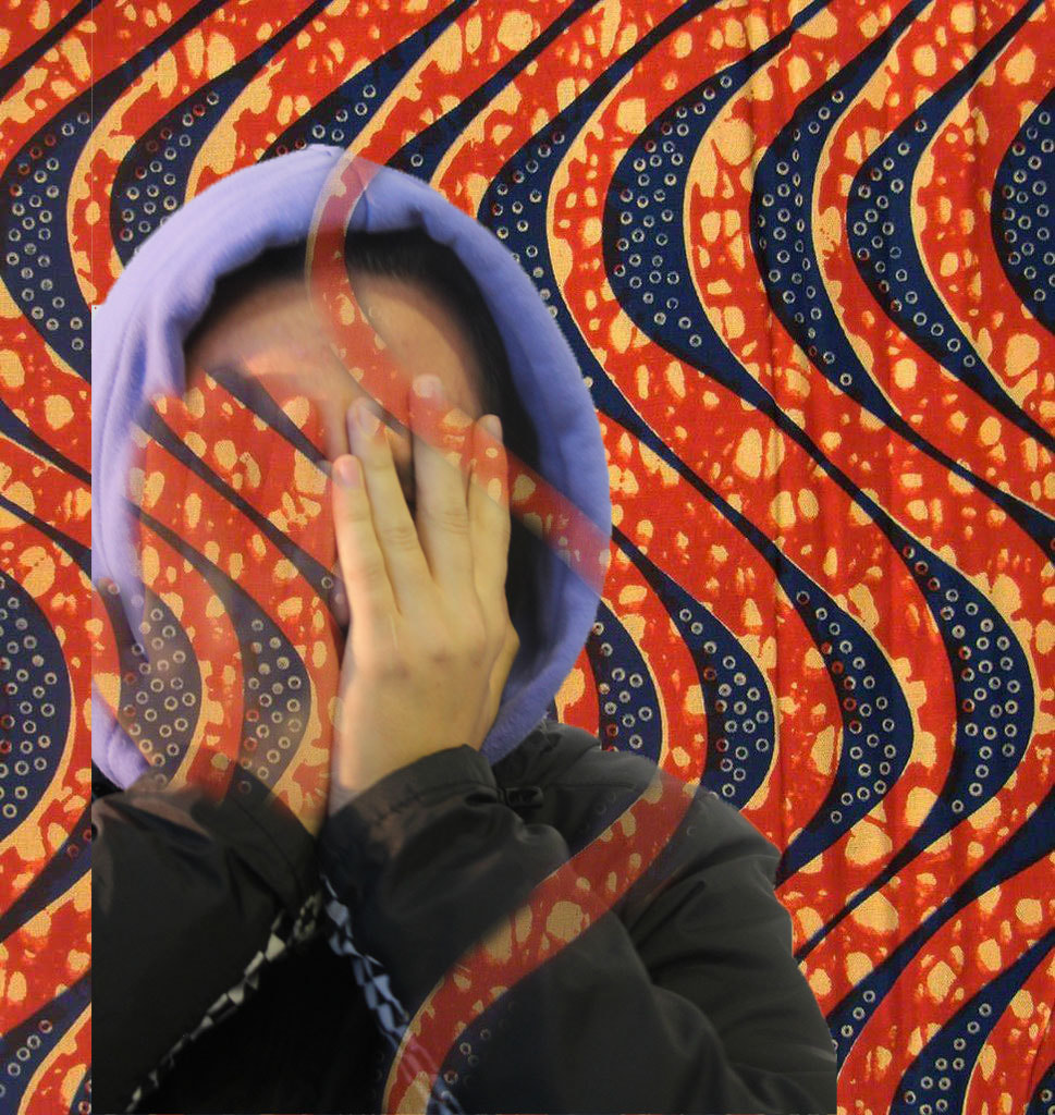
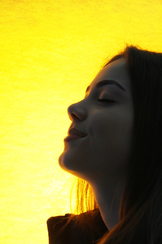
In 2005 French riots occurred which caused outrage in Paris, France and the media. This led to everyone in the area being portrayed as bad people which was not true and was therefore proved by a French photographer named JR who went around photographing his friends doing different faces and then let them pick the photo of themselves that they liked the most. As a result of this, it then inspired me to take photos close up and let the model of the photo decide the picture of them that they liked the most. JR's talents took him to many places; his career began by being just another average teenager with a passion for graffiti. He purely enjoyed the movement of graffiti but it wasn't until he found a camera on the subway that his perception of street art changed. Like JR, I blew up the photo and stuck it around different places in my school.
|
|
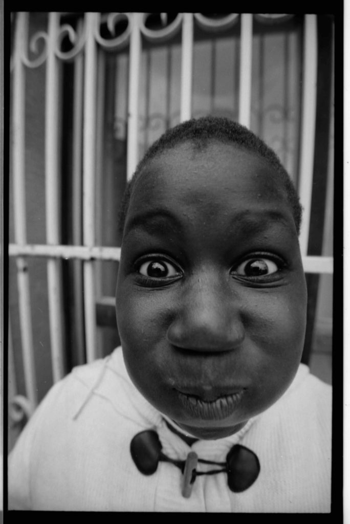
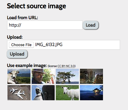
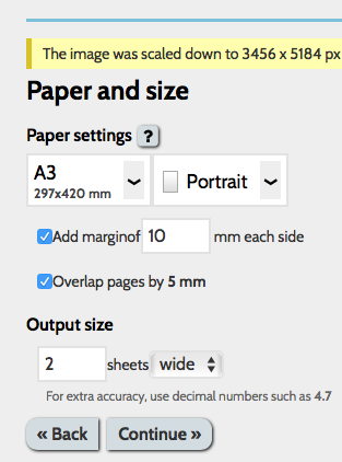
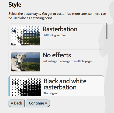
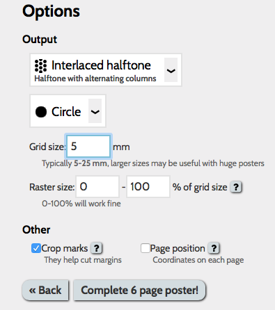
After I got these photos I asked Yasemin which one of her photos was her favourite. By collating her feedback, I then put it on a website called Rasterbator which you can then convert images from normal size up to a2 size.
|

|
|
|
|
|

|
|
|
|
|
|
|
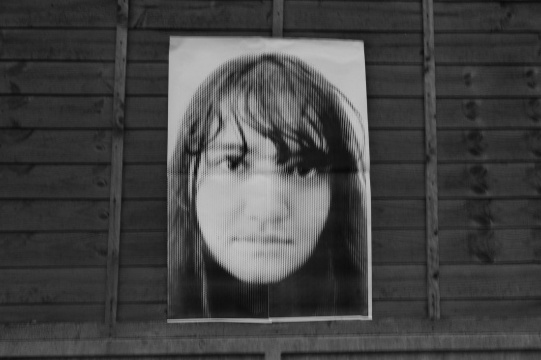
Here are my responses to JR's work, I took these photos in a variety of places around my school to try and recreate JR's work as he went around Paris and then stuck up photos of people who lived in the area of the riots. Furthermore, he showed to the general public how they weren't as bad of people as the media was portraying them to be. Ultimately, the media was conveying everyone who lived in that specific area as ignorant, pessimistic, substandard civilians.
WWW: The black and white tones accurately match the work of JR's. This is seen through the schematic theme. EBI: I could've asked Yasemin to pull less monotonous facial expressions to closely link the accuracy within JR's photos to a greater extent. |
Response
|
|
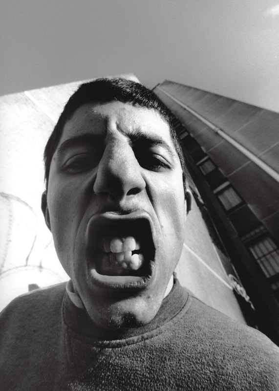
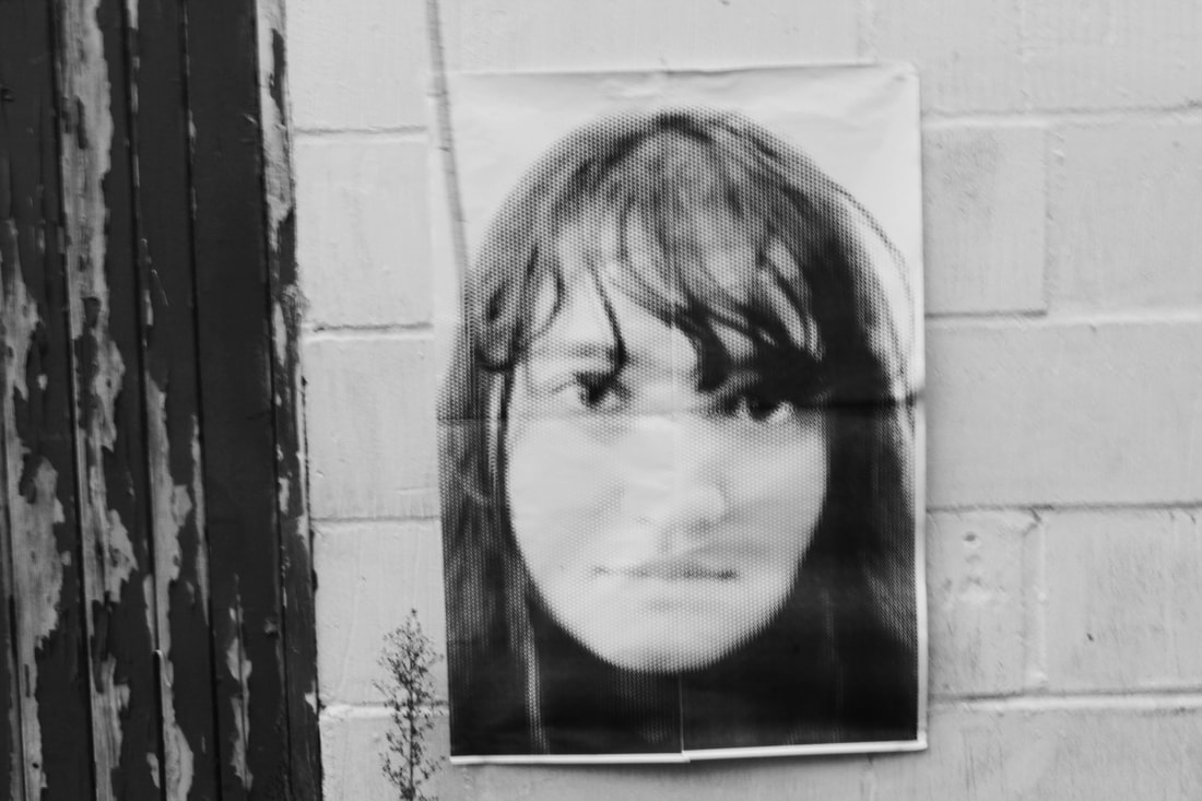
For this response, I took these larger photos of myself home to then proceed to take them to a suburban landmark called Forty Hall to stick these photographs up, accurately recreating JR's work around Paris; this was accompanied by my own making and my individual inspiration.
WWW: I am proud of my attempt of looking slightly down at the camera which matches JR's work in that aspect. EBI: I could have taken more consideration into the editing side of my creation. For instance, making the black have a deeper contrast which is shown in JR's work. |

|

|

|
Gordon Magnin

|

|
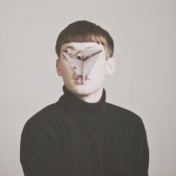
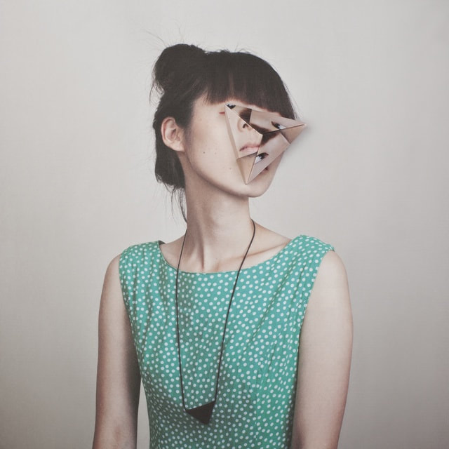
Gordon Magnin is a Los Angeles based artist who produces work that is deemed to be a perfect response to his environment. This is due to Gordon Magnin living in a city that is visually influenced by celebrity and Hollywood marketing and advertising. Gordon Magnin creates photos that are visual optical illusions that are eye-catching and pleasing to the human eye that fixates whoever comes across them. He achieves this by placing objects in front of peoples' faces and therefore making them more engrossing and compelling. By Magnin doing this, he will accomplish unique pieces of art that no one has seen before.

|

|

|
In my response I gathered photos of Aleks and I placed shapes in front of Aleks' face. Following this, I repeated them several times and then I get the exact same shape and position it in a different place on his face. Lastly, I would duplicate it around 5 times again and move it slightly everytime.
WWW: The triangular shapes placed on parts of Alek's face in the first photograph, strongly match Magnin's creations. I done this to generate a more professional, accurate and realistic representation of his work.
EBI: Alek's facial expressions could have been slightly more on the serious side, enhancing the potential identical effect of Magnin's photographs.
Kehinde Wiley

|
|
|
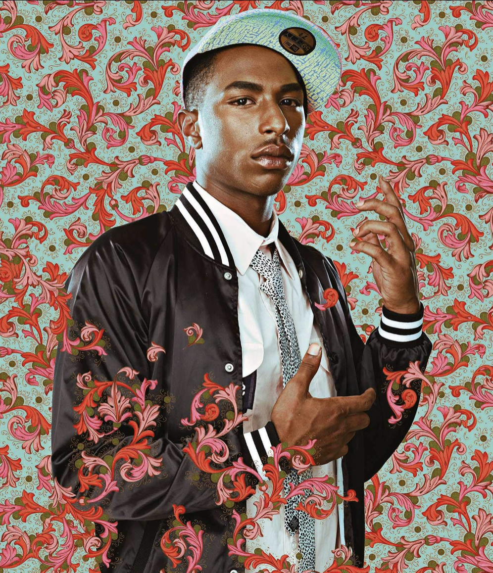
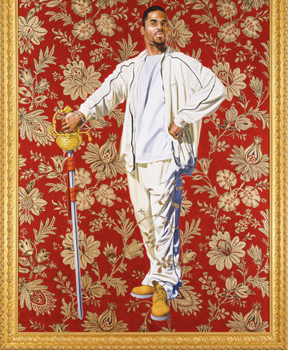
Kehinde Wiley is an American portrait painter based in New York City. He is best recognised for his utterly naturalistic paintings of African Americans. Wiley is influenced by many factors such as portraits of Napoleon Bonaparte, Islamic architecture and hip hop culture. The young, African-American quite literally changes the face(s) of portraiture with his sensitive, vibrant and political portrayals of black folk; ranging from teenagers he meets on the streets, to fellow contemporary artists, and even former President Barack Obama as seen above. Wiley is a very unique artist: there is no one quite like him. He incorporates a range of vernaculars culled from art historical references into his work. Furthermore, Wiley's artistic creations melds a fluid concept of modern culture, ranging from French Rococo to today's urban landscape.

|
|
|
In this edit I photographed my brother and my friend from school (Aleks). I then put a traditional background that would typically be used by white civilians centuries ago. Additionally, I edited 2 of the photo's and brought segments of the photos infront of them.
WWW: On the left photo of my brother, the editing was done very precisely, ensuring that the parts I wanted to overlap him were overlapped. This gave a sense of professionalism. Again in that particular edit, the leafy background links with the floral background of Wiley's work. EBI: On the right photo, my editing could've been a lot more precise. This is only a minor factor as it isn't that noticeable, but I know within i could've made it more professional. |
|
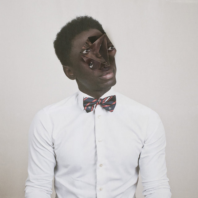
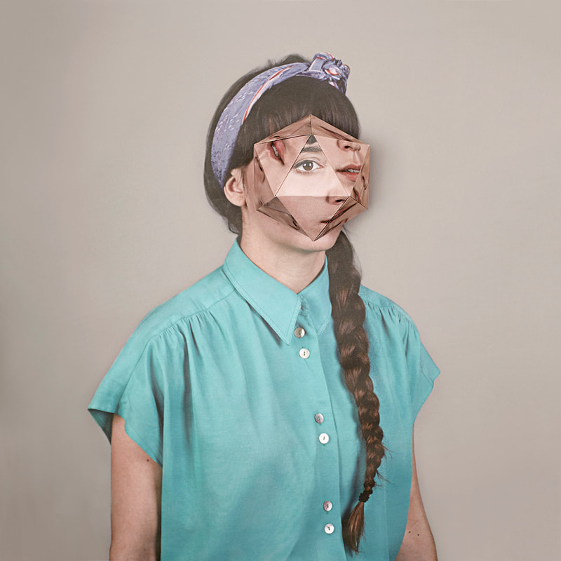
Alma Haser
|
|
|
|
Alma Haser is a photographer who uses different editing techniques along with different origami styles to interest the younger generation in her art. As a result of this, her work interests me because it is a new subject of what we have done in photography and we have never done anything like this before. Moreover, the contrasting colours, effects and designs are mesmerising and give a sense of variety and uniqueness. By creating origami, we get to view various perspectives of the people we have photographed. Ultimately, the lighting plays a fundamental factor because it helps the audience contrast the different colour schemes along with the shadows. From a student's perspective, Alma uses these techniques as there is clearly a deep meaning behind her work; this message could be to show ones' true colours and perhaps their 'hidden identity'.

|

|

|

|
Overall in my response, I collated photographs of myself and folded them in an origami form. Next, I proceeded to sticking them on an A4 size photo with 4 of them being in colour and 4 being in black and white. The different tones of the photos being in colour and some being in black and white, create different forms of art.
WWW: The photos have a strong symbolisation with the slightly rustic theme that is shown in Haser's work. Also, the slight smirk on my face is very similar to the people's in her work- as none of them are completely serious.
EBI: I could've made the origami slightly smaller to make it more or less identical to Haser's work.
Fragments of a Building
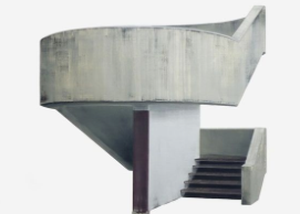
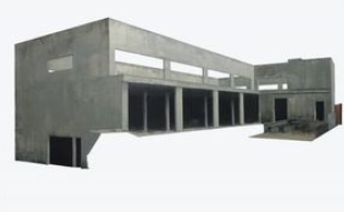
Patrick Cornillet
|
|
|
|
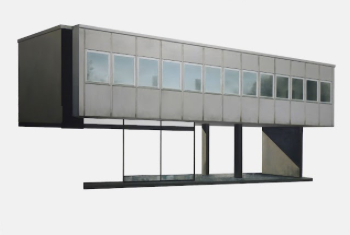
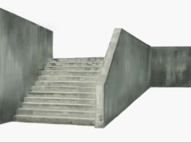
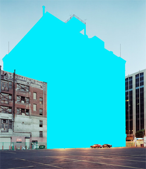
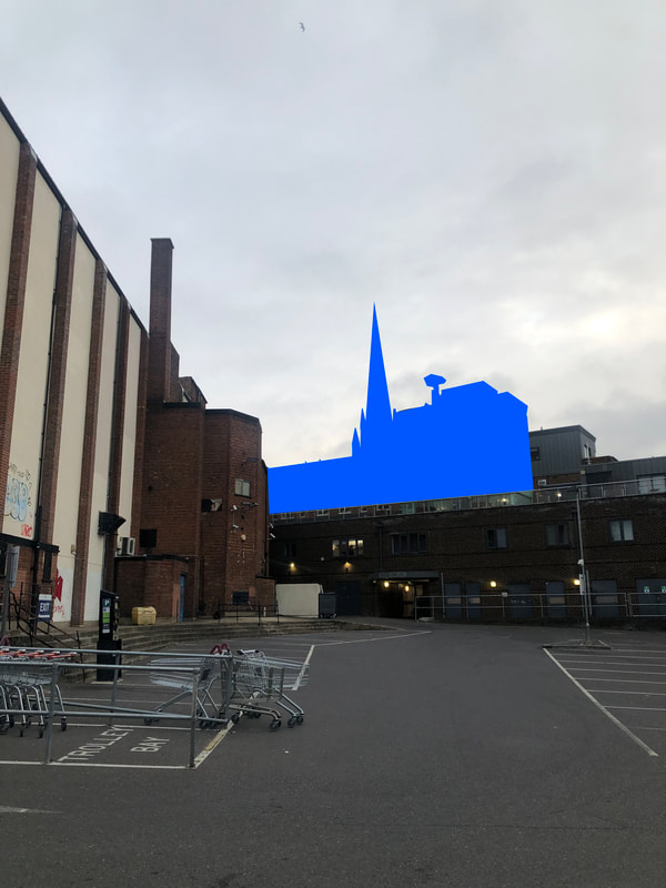
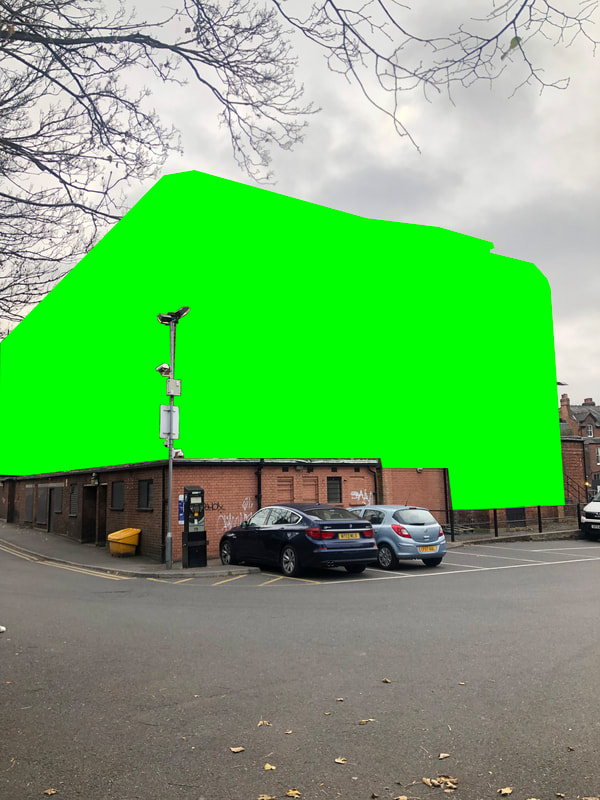
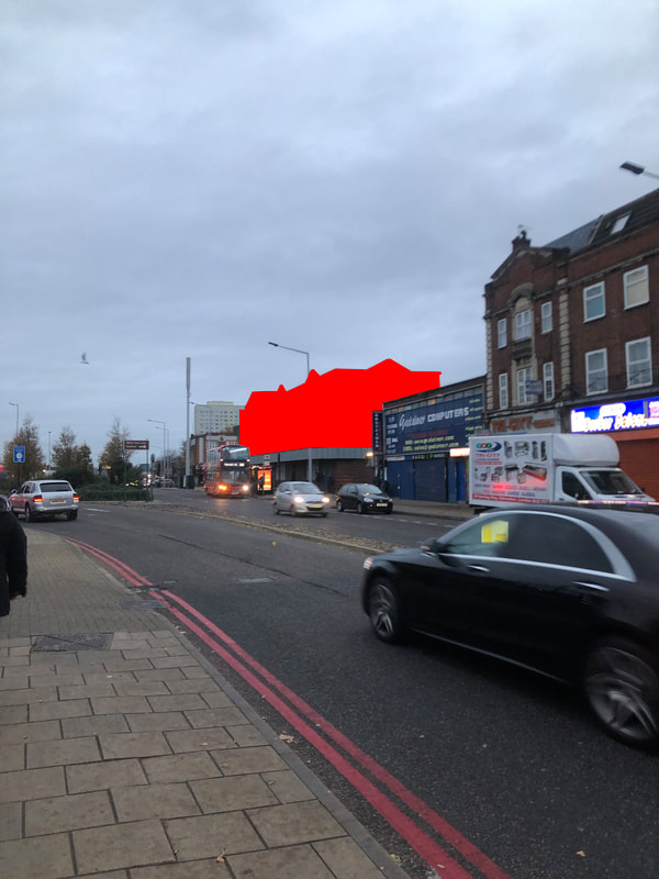
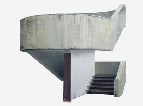
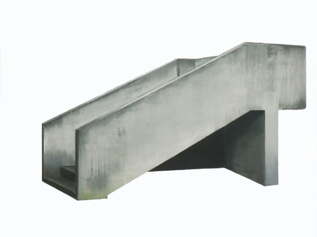
The French Patrick Cornillet, unlike others is a painter not an actual photographer. He takes photos of typically uninteresting things. These include stairs and tedious buildings. He then edits out backgrounds and everything else surrounding the objects and corrects everything else white. Cornillet painted architectural components (removed from their surroundings) and recreated them as objects on a white backdrop in the work. The concrete reminds the majority of the audience of the real world, human remains and of the passing of time. Cornillet produces unique and fascinating work, even though the buildings are old and the spaces appear uninhabited and dehumanised.

|

|

|
In my response I took photos of the interior and exterior of school buildings and of a railway station as shown. Then, I edited the background white to flush out everything that wasn't needed to focus on what is in the foreground of the photographs.
Mauren Brodbeck
|
|
|
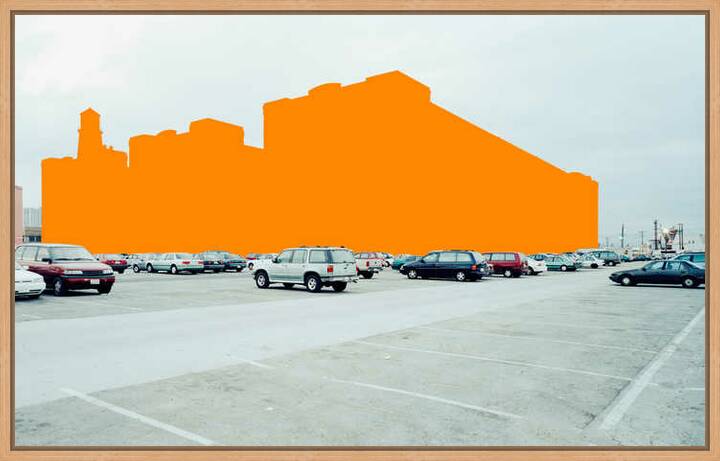
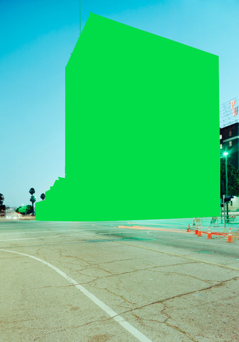
Pedestrians are oblivious with the structures and parking lots seen in Mauren Brodbeck's images. They're so unassuming that their existence is called into question. We give them such little attention that we recall no memory of what they look like; they are a mental blank. The Swiss multi-sensory artist and singer-songwriter, uses visual and auditory elements to create startling reinterpretations of common objects and experiences. For example, she photographed buildings in both Los Angeles (where she was living) and Geneva (where she grew up). Brodbeck looks at buildings as if they are sitting for a portrait. She quotes "The idea is to photograph buildings as though they were people".
|
|
|
In my response I took photos behind a cinema and infront of Lidl making sure that there were no people in the foreground of the photographs. People in sight of the photos could've effected the message, vibe and accuracy of my work.
WWW: I used similar colours of the overlapped outline of the buildings to place in front of the real thing just like Brodbeck did. This let off the illusion that Brodbeck wanted to achieve. I also ensured there were no people and no unnecessary objects in the photographs that could've effected the result of my work, just like Brodbeck.
EBI: To improve the result of my work, I could've blurred and edited the tones of the background (as seen in the original) to perfect my replica. For example, I could've blurred out the sky.
Thomas Kelner

Thomas Kelner has shown his artwork in solo exhibitions in Germany, Australia, Russia, China, France, Poland, Denmark, Brazil and the USA since 2002. he has been involved in numerous group exhibitions and publications. His works are represented in important private and public collections. The contemporary artist is mainly associated with deconstructionism and cubism. The purpose of his collage-style artwork is to bring together visual elements to explore their commonalities. Ultimately, the German fine-art photographer uses large-format photographs of famous architectural monuments, which is explored through many individual images and a shifted camera perspective to look like "photo mosaics".
Strands
Patrick Cornillet
|
|

|
Cornillet works with painting, combining the realism of photography with the delicacy of brush strokes. His art looks at concerns of visualising as well as urbanity. He photographs empty structures and isolates fascinating shapes he notices within. He then makes the background (to whatever he's photographed) to white to show that what he's photographed has probably been seen before but is simply not concentrated upon. The background is plain to eliminate unnecessary distractions from the main photograph.
This is my slideshow of the photos that I took (unedited). I went outside of Lidl and photographed the exterior of the shop.
Malick Kebe

|

|

|
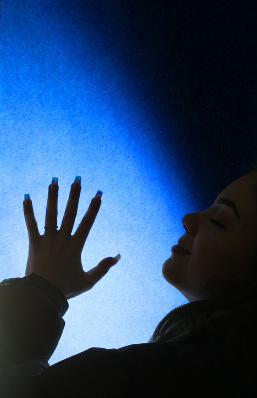
Malick Kebe is from a city in West Africa called Abidjan. He use's LED light's to bring out the background colours. I admire this technique greatly because the colours take away the attention from the face in a way, due to the fact it is just the outline of a person and nothing more is really visible (i.e no exact facial features). He focuses his artwork on bold, high-contrast images filled with energy. All of his artwork is photographed with iPhone technology. Through iPhone technology, Kebe "builds a universe that mixes modernity and African origins". He admires the camera work of the iPhone so much that he has previously stated: "even if I had the means, I would still shoot on iPhone".
My Response
|
|
In my response I recreated this and took photo's of my brother with my own LED strips inside my bedroom. I then held up a screen of the coloured photo, that was being displayed, to add in the extra lighting- trying to emphasise the features (like Kebe) to my maximum potential.
WWW: I used my LED lights that I have in my room to try and recreate Kebe's work. I put my light on the colour red just like he did in one of his creations. EBI: I could've made my brother improvise with his posing to make it resemble Kebe's work even more. My brother could've performed slightly more abstract poses that could've brought out the real meaning behind the photos. |

This is my first attempt of editing Malick Kebe's work. It clearly has a lot of areas made for improvement. This is because the editing is not very accurate or professional and where I brought out the colours of the background, it was also partially brought on to the parts of his face. Therefore it looks no where near as fixating as Kebe's creations.
WWW: I tried my best to edit the tones of this photograph. Kebe is seen to do this in every one of his photos and it is done flawlessly.
EBI: I could've experimented more with fluctuating the editing on different parts of my brother's face to make it clear and mesmerising like Kebe's.
WWW: I tried my best to edit the tones of this photograph. Kebe is seen to do this in every one of his photos and it is done flawlessly.
EBI: I could've experimented more with fluctuating the editing on different parts of my brother's face to make it clear and mesmerising like Kebe's.
Development
|
|
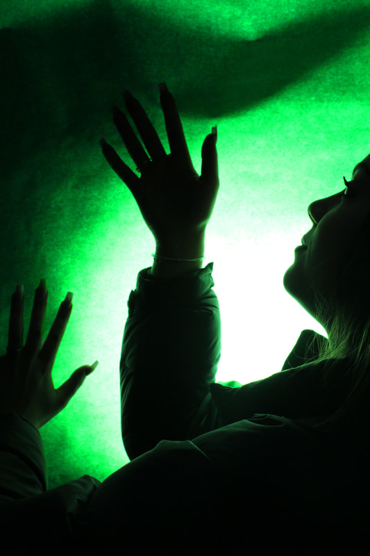
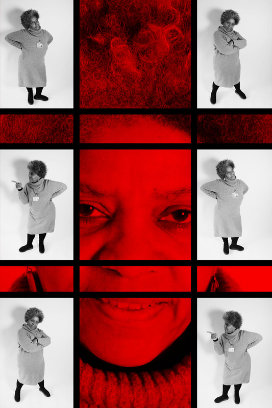
In this development I took photos of Erin with a fully coloured blush, salmon background. This was accompanied with a strong white light behind it. The reasoning for this is that it brings out the coral tones in the background, therefore transferring a hint of this onto the face.
WWW: The bright, rosy background compliments Erin's darker hair which makes it stand out. Her hand poses also contrast nicely against the background. EBI: I could've asked Erin to change her posture to have a better variety of poses. |
|
|
|
These are my edits of Erin against the coloured lights. Lighting is a key factor in creating a successful image. The lighting that I chose determines not only brightness and darkness, but also tone, mood and atmosphere. Therefore, it was necessary for me to control and manipulate the light correctly in order to achieve the best texture, vibrancy of colour and luminosity on this subject.
WWW: The coloured background that I chose holds a world of information and enables the viewer to understand the context in which the photograph was taken. My colour choices improves the entire composition and adds meaning and depth to the photos. I think that they strongly replicate Kebe's work.
EBI: I could've slightly blacked Erin's face out more to create a darker shadow against the bright lights.
Bene Rohlmann
|
|
|
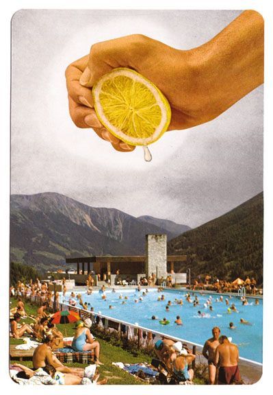
Bene Rohlmann is an artist based from Berlin who works for editorial clients and has his art shown in various different exhibitions globally. The photo's create an utterly powerful feeling of surrealism. The juxtaposing fact looks like everyone is having fun enjoying themselves when in reality it looks like there is something about to ruin that happiness generating a very interesting, compelling and gripping element to them.
|
|
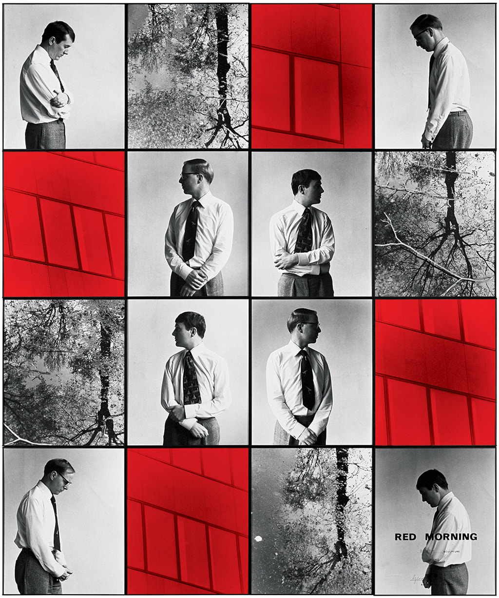
This is my slideshow for my Bene Rohlmann response. In my edit for this I am currently editing out the hand and spoon with the water droplet underneath. This well then be transferred and put on top of a plane taking off to symbolise the supernaturalness in all of Bene Rohlmann's photos.
WWW: My slideshow gathered the main idea of Rolmann's work as the water droplet is ever so slightly gripping on to the spoon, when in reality, it's about to fall. EBI: I could've edited my slideshow to look more rustic and old (like the original) instead of the clean and clear look that I went for. |
Development 2 - Gilbert and George
Gilbert and George are known for both their diverse practice and their carefully composed personas. Partners in life and art, the two only ever appear together in public while wearing matching tweed suits. Gilbert and George met as students at the St Martins School of Art. They found fame in 1969 with their performance The Singing Sculpture. The dirty words pictures and slogans are juxtaposed with distressing views of urban life and the artists' gloomy presence in the Dirty Words Pictures. The images show a lot about the changing character of urban existence and altering views towards sexuality by relentlessly exploring elements of 20th century confusion. The microcosm of London's East End was used by Gilbert and George to portray society as a whole. These tough images, which were painted in harsh black, white, and red, posed several concerns to the audience, such as: Which is more obscene: expletives or societal injustices?
|
|
|
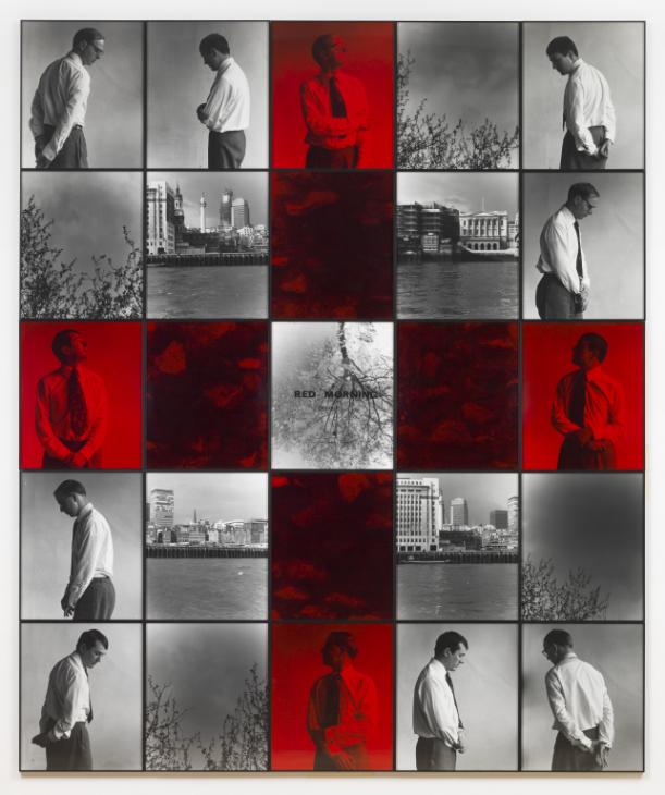
First development attempt
In this home development I started off taking pictures of my brother before continuing to take pictures of Mr Hesse to show the change in diversification between now and the time of Gilbert and Georges work. The field is somewhere between where my brother and I live and where my teacher and I go to School.
WWW: Mr Hesse is posing quite abnormally but still maintains a monotonous face with no obvious facial expression; this makes it unique and engaging. Furthermore, the vibrancy of the field captures the attention of the viewer that it forces them to look at the black and white images.
EBI: To make the overall edit more interesting, I could've split up the solo photo of the field into 4 individual photos and perhaps spread them out to create variety within the photo.
I realised after this edit that I had missed the idea of Gilbert and George and that my work does not correlate with the type of work and the message that Gilbert and George so strongly send out with their work.
First development

This is my first edit that I completed. You can clearly see that there is very much room for improvement in the photos because I don't yet have any photo's of Abdi's area in this first development and this is crucial towards Gilbert and Georges work because they have this in every single one of their dirty word photos because it represents how society was viewed as a whole at the time of the photo's being taken.
WWW: I used the same red design- as seen in the original- and the black and white tones compliment the bright colour nicely.
EBI: I could've collated more photos of Abdi and minimised the size of them to have more photos but at a smaller size.
WWW: I used the same red design- as seen in the original- and the black and white tones compliment the bright colour nicely.
EBI: I could've collated more photos of Abdi and minimised the size of them to have more photos but at a smaller size.
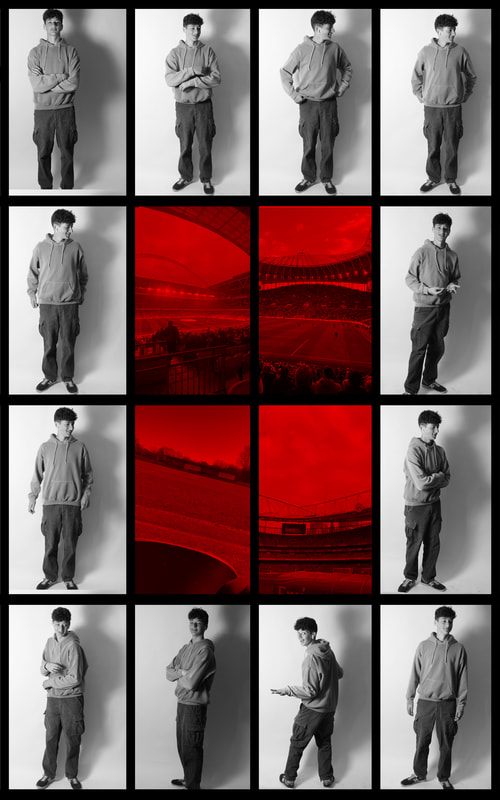
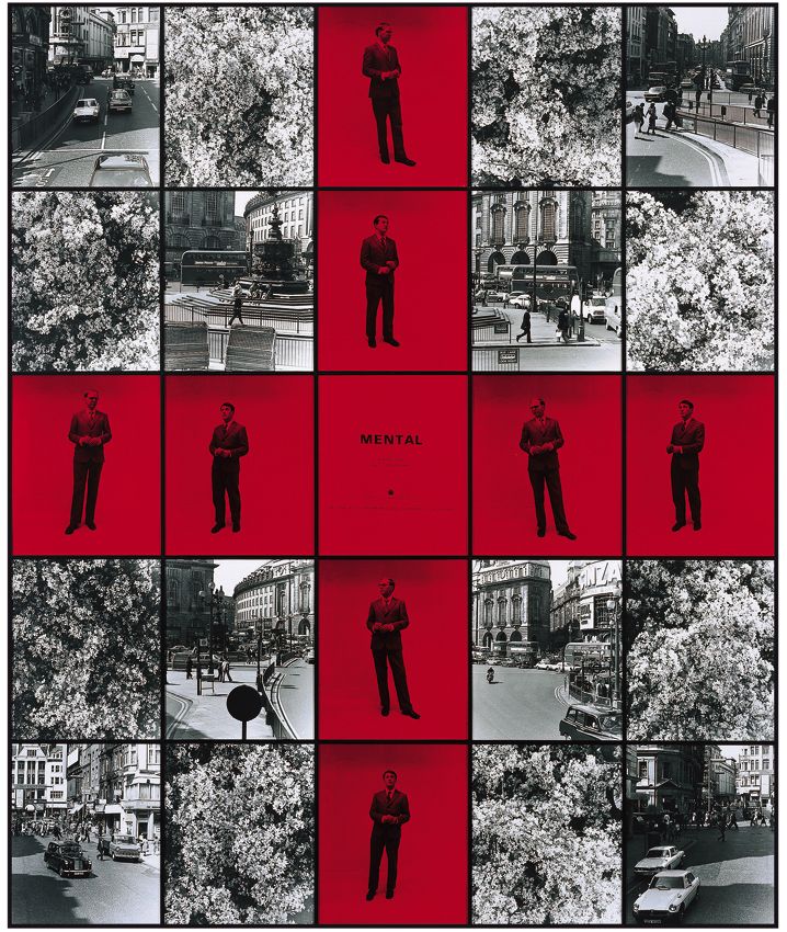
In this development I decided to put the photos of Oli around the outside and in black and white then the football photo's in red in the middle because football is a massive part of his life therefore I decided to do the photo's of all the different grounds that I decided to visit for him.
WWW:
EBI:
WWW:
EBI:
|
|
I like how in Gilbert and Georges work, it is all fragmented with there being some of them in colour (mainly red) but then also how there is more that is also in black and white. He photographs people and the area's that that are associated with them, mainly the area's that they live in and then puts them in orders of photo's of them then and then also with the area's that they live in.
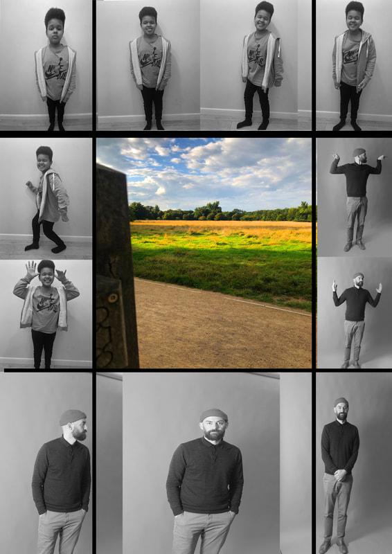
WWW: These are samples that I took of my friend Nathan. Nathan is clearly expressing his personality through the power of posing. So far, these make satisfactory segments to turn into a final edit. EBI: If I really wanted to make it accurate to Gilbert and George's work I could've asked Nathan to take off his coat and let off a more natural, laid-back look. |

In this further development of Gilbert and George, I took photo's of Nathan and of his area that he lives in. I like how Gilbert and George chose the colour red, I think potentially this could've been because they were a gay couple and could potentially of faced violence. Something that I could improve upon could be me having some sort of co-ordination between the photo's of Nathan's face I used and where they go and what ones of his body I use and where they go. I also like how I have different poses and it shows how people can have different sides to them. I think that this is shown by the fact that there isn't a single photo of Nathan there twice and even though they are all showing the same things they are all slightly different in their own ways. People photographed are not always how they are perceived; just like the fact that Gilbert and George are gay, that doesn't say anything about them as photographers.
WWW: Overall, I think I portrayed the message that Gilbert and George do within their artwork. The fact that I made Nathan pose in various ways makes the viewer question his true identity. I also like how I didn't duplicate any of the photographs otherwise that would've made my final piece basic, boring and repetitive.
EBI: I could've thought about the placement and order of the photos in greater depth. I think I placed them randomly and didn't reflect on the deeper meaning of the importance behind placement.
Final Piece
|

|
This was my final development of recreating Gilbert and Georges work. I took whole body photos of my friend Nathan and Ms Lewis followed up by a close up photograph of their faces, I then put 3 of the photos of their whole body's on top of the close up of their face's and doubled the ones of their body's to make them appear 6 times in total, and then added the black lines as borders between all of them. They show that people aren't always as bad as they seem, this was done in my development by showing a serious photo of Nathan and Ms Lewis as the background of them looking slightly intimidating and then the 6 photo's (3 used twice) of them being more funny/less intimidating. This also has a link back to the work that I did on JR.
How I have developed Gilbert and Georges work from my first development to what I have now is. In my first development of Abdi, I took multiple photos of his face and also his body, but I didn't know how to put them together properly for example I had photos of his body and also his face all mixed ups together with the black and white in a line down the side with gaps for only the black lines, so for my second development I decided to put the photos of Oli in black and white all around some photos of things that he liked in red to bring the sense of Gilbert and George's work into my own. For my third development, I decided to switch the colours around by putting Black and white photo's of the area that Nathan lives in the middle to show this side to Gilbert and Georges work. For my last development I decided to include the rule of thirds into my editing, and to decrease the number of photos that I used and used them twice instead but put them in different places across the edit to make sure that you cannot escape them, and I put gaps in the photos so that the big red photo's of Nathan and ms lewis covers the whole background can be almost leaked through.
How I have developed Gilbert and Georges work from my first development to what I have now is. In my first development of Abdi, I took multiple photos of his face and also his body, but I didn't know how to put them together properly for example I had photos of his body and also his face all mixed ups together with the black and white in a line down the side with gaps for only the black lines, so for my second development I decided to put the photos of Oli in black and white all around some photos of things that he liked in red to bring the sense of Gilbert and George's work into my own. For my third development, I decided to switch the colours around by putting Black and white photo's of the area that Nathan lives in the middle to show this side to Gilbert and Georges work. For my last development I decided to include the rule of thirds into my editing, and to decrease the number of photos that I used and used them twice instead but put them in different places across the edit to make sure that you cannot escape them, and I put gaps in the photos so that the big red photo's of Nathan and ms lewis covers the whole background can be almost leaked through.
